Tag Archives: creativity

A Lesson In Art and Perspective

A Lesson in Art: Distance and Perspective: There’s a cavern in California called the Moaning Caverns. My son and I explored it on a trip to California,  when him and I were much younger. So what does the cavern have to do with a lesson in art and Perspective?

You can fit the Statue of Liberty-minus the pedestal- in the first and largest single cavern space in California but looking up you would never have imagined the space to be so large.

Lake Texoma: Distance and perspective

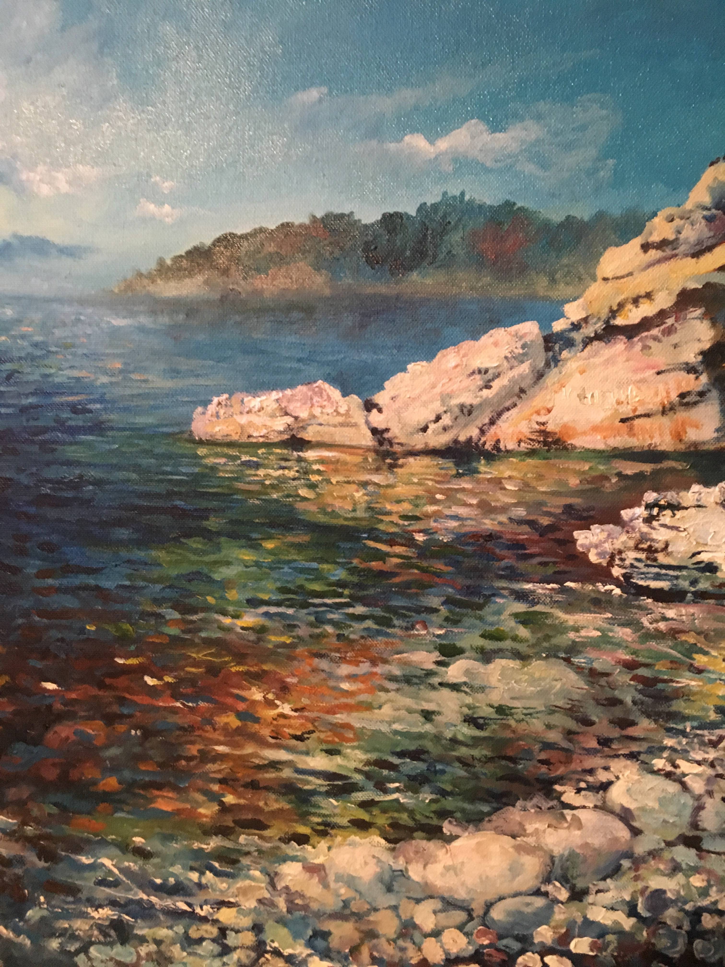
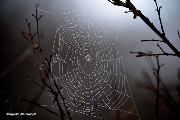
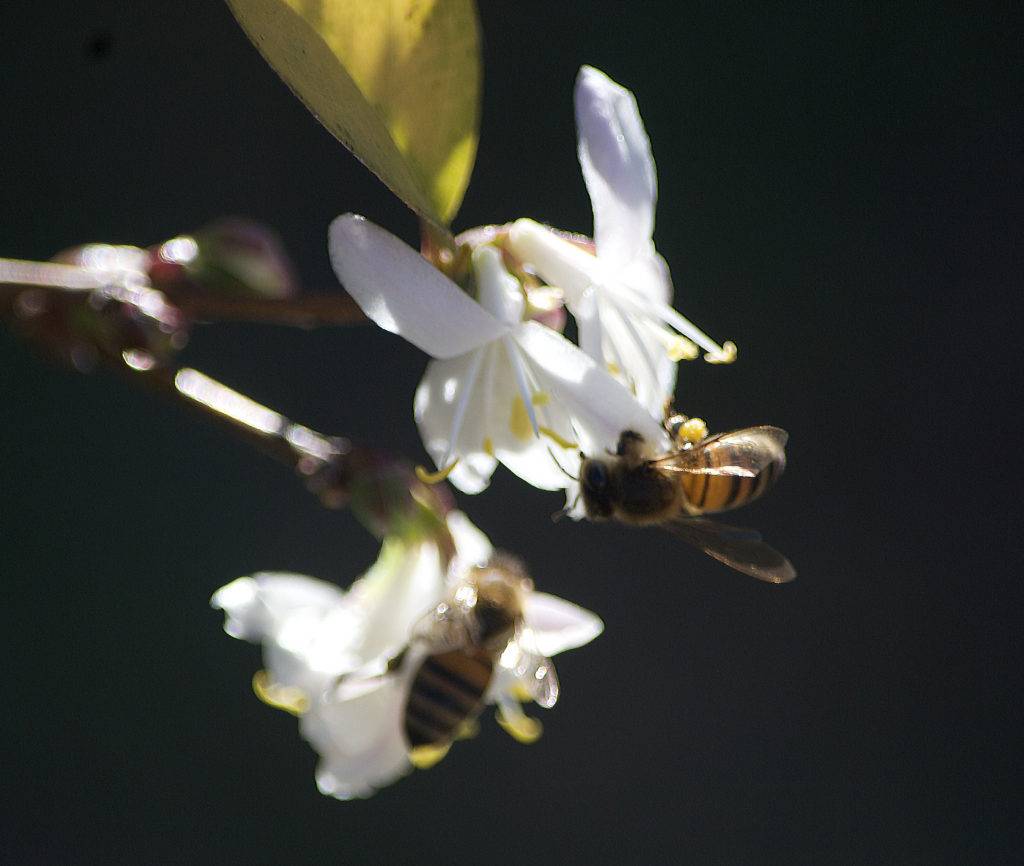
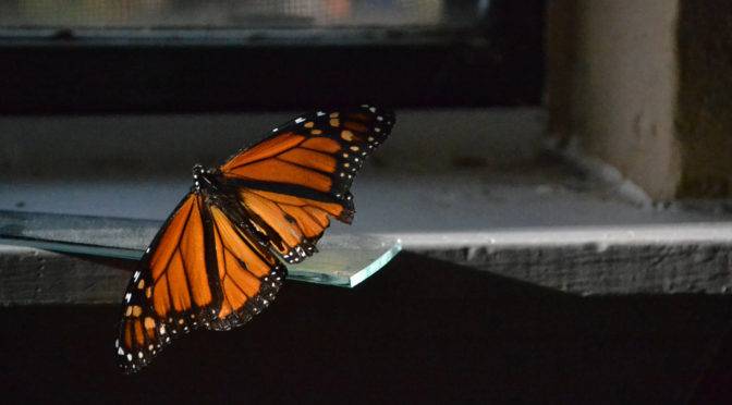
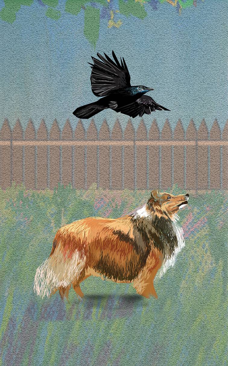
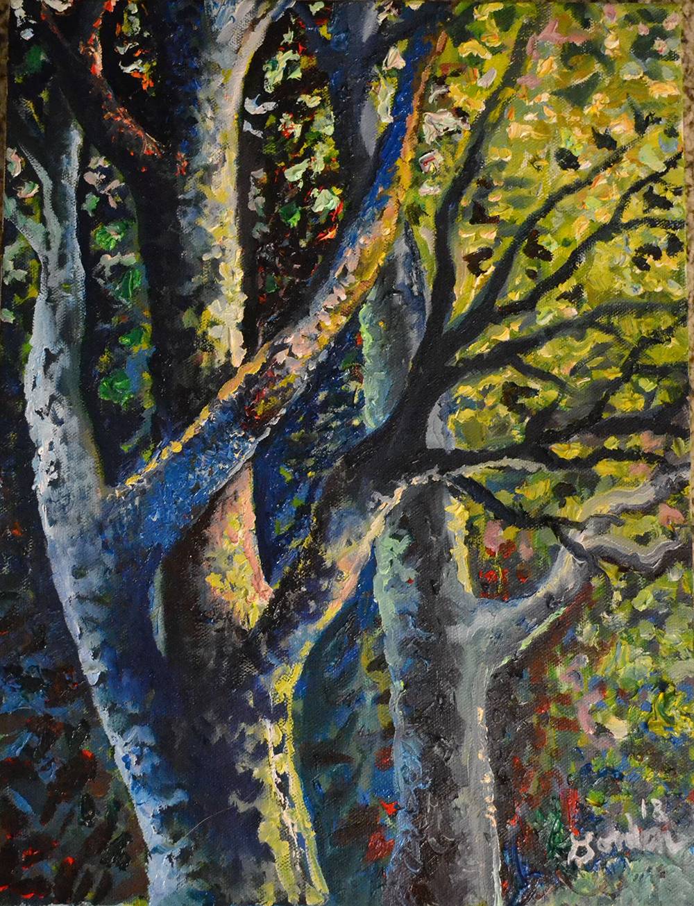
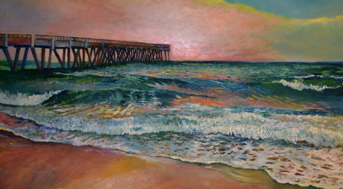
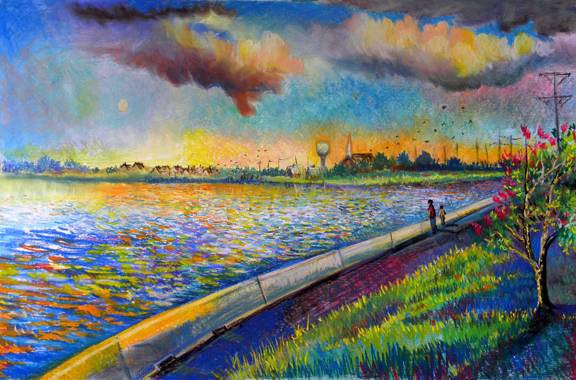
What is missing is perspective, large to small rocks, colors, etc-you know the distance is there but there are no cues to prove it to your eye. In creating art with depth, you also have no cues to explain  distance and allow the viewer to truly experience the space you’ve created because it is on a flat dimension.

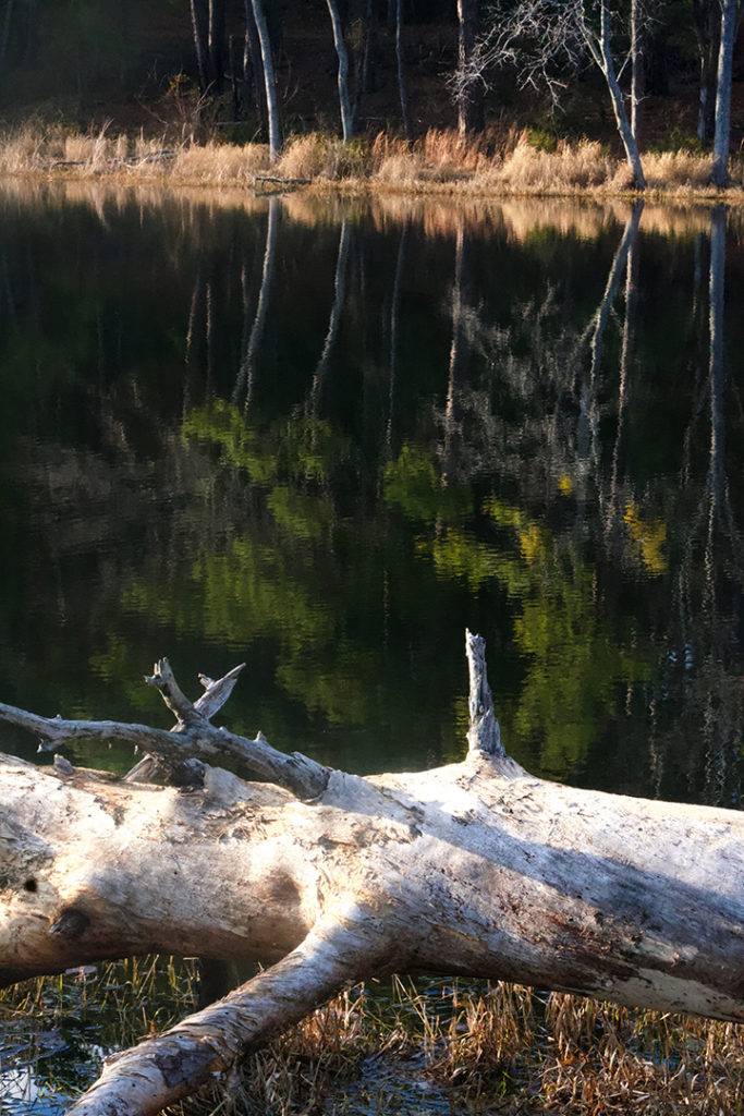
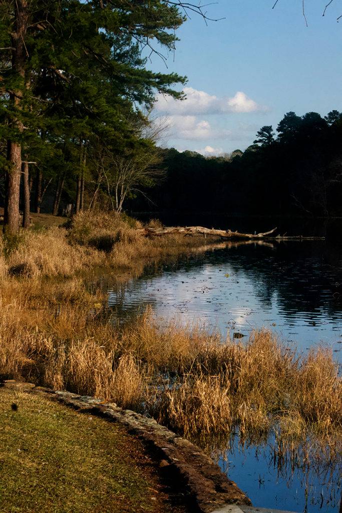
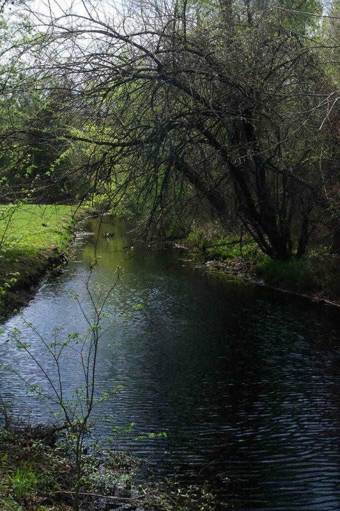
Have you ever photographed a great expanse of a landscape and you couldn’t understand why the results were less than spectacular compared to how it  looked? It all has to do with cues that explain distance and perspective.

Pastel on Paper: Rowlett Texas

Art Lesson: Visual Cues act as Tools

In art you have several tools to explain to the viewer what you are trying to describe:

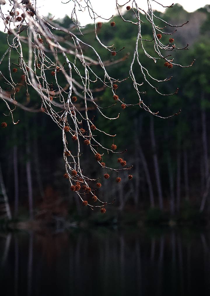
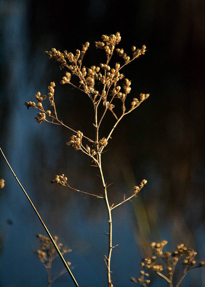
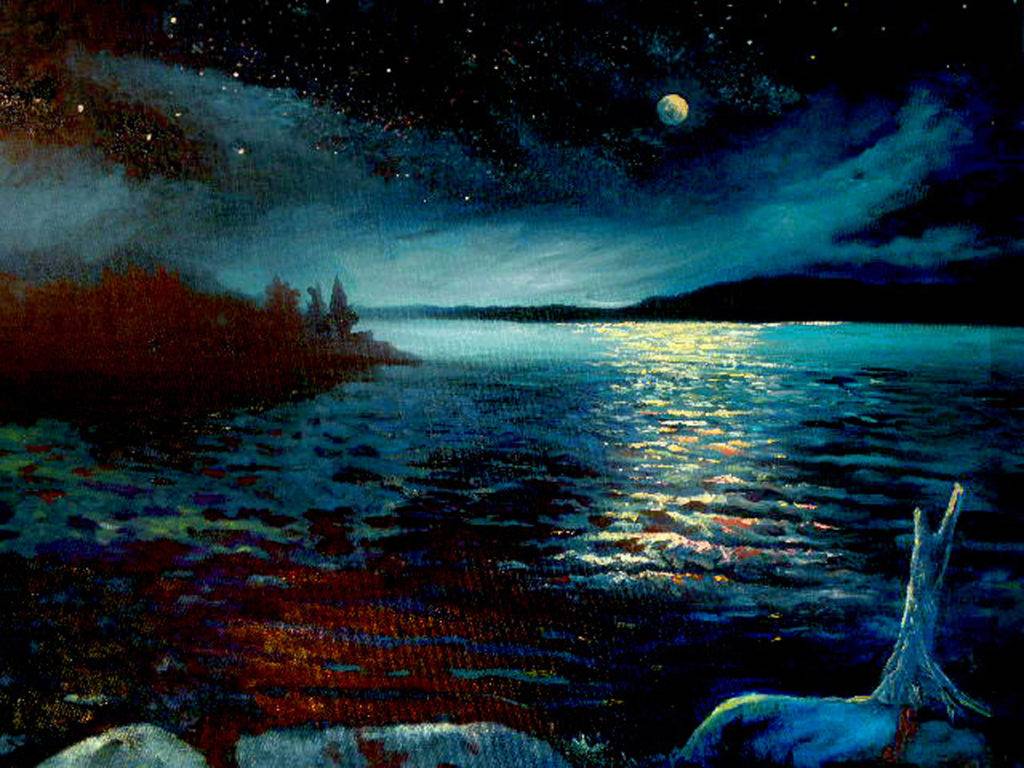
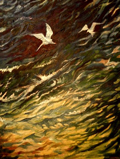
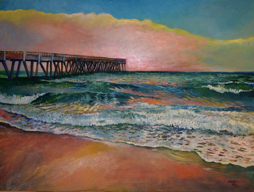
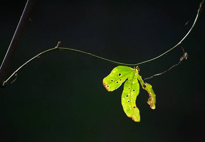
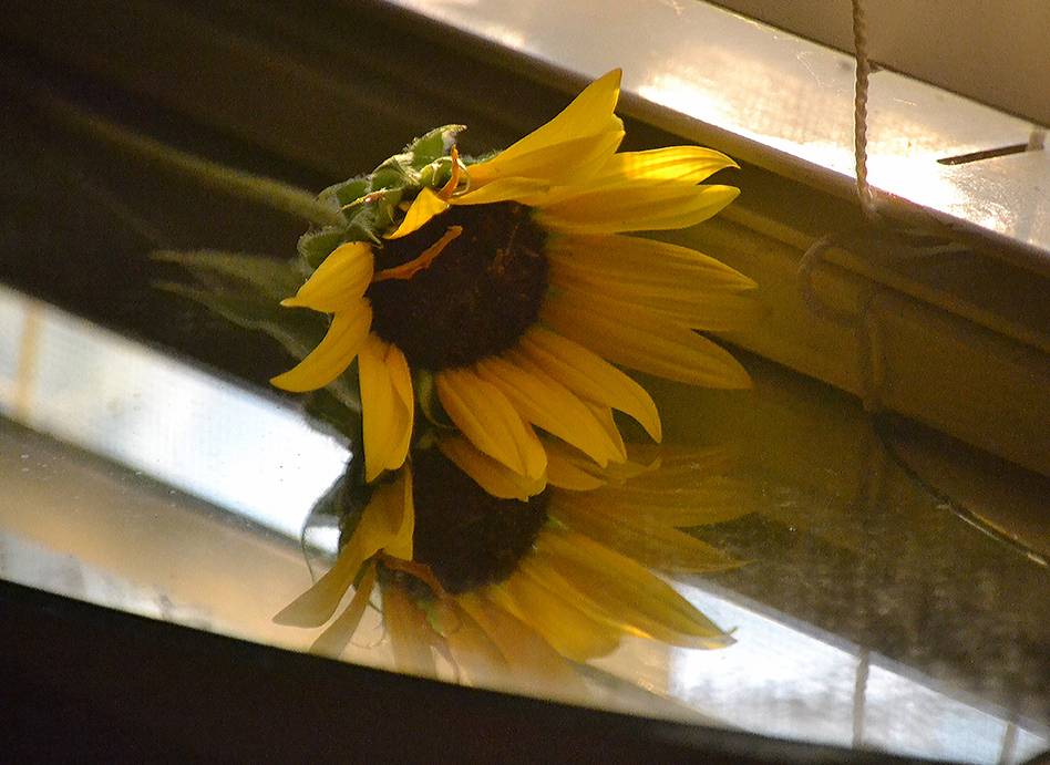
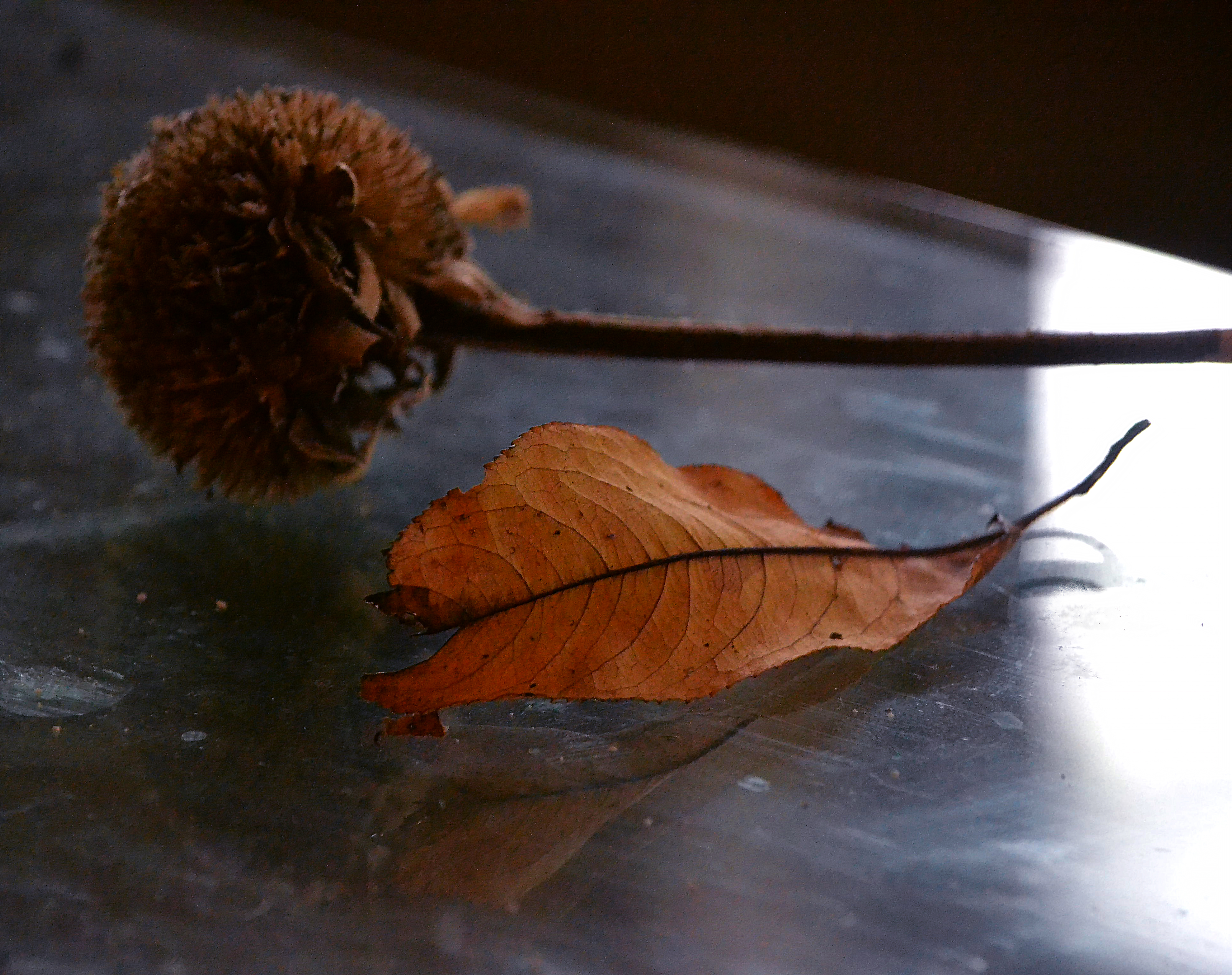
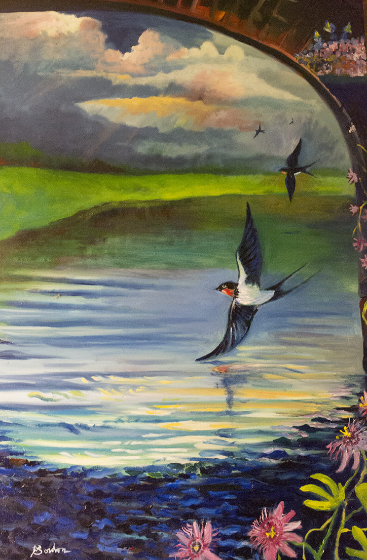
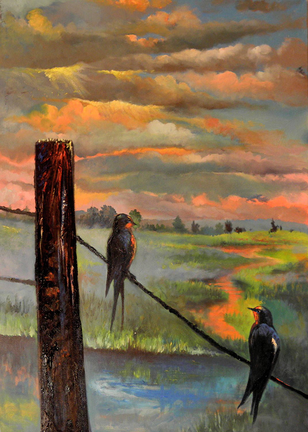
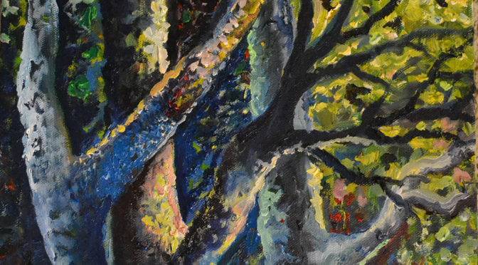
Color: The change in color denotes distance.

Value: The shades of color, intensity, etc. all show the viewer there is distance and gives the image its perspective.

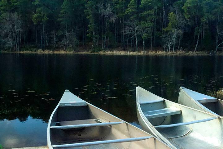
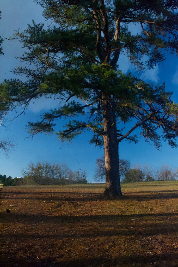
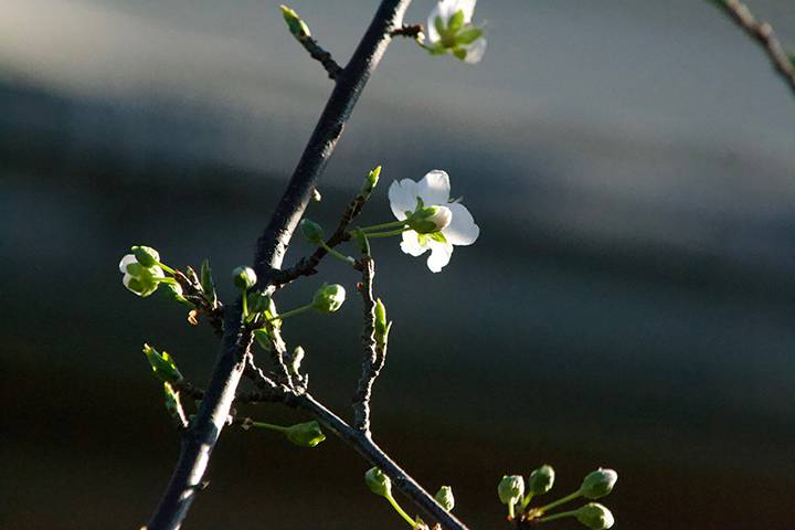
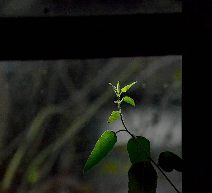
Perspective: The eye sees images that get smaller as they sit further back into the distance, giving these cues give the viewer the dimension that is really just an illusion on a flat canvas.

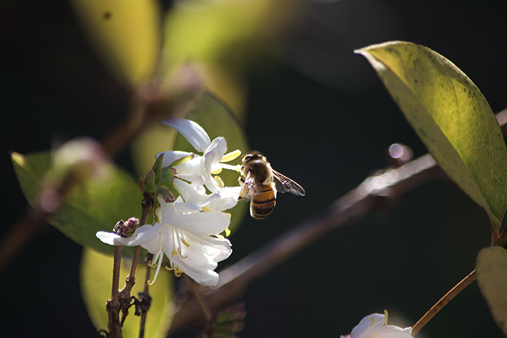
Converging elements: To further support perspective-a line that moves through your image allows the viewers’ eye to go where you intend them to go and experience the image and the artists’ intention of space.

A work of art is much like an illusion a magician creates, the control and the process in which the Artist leads the viewer through the flat image will allow the viewer to experience a painting as it was intended.

HOMEWORK: Photograph an expansive landscape with no thought of perspective or color, etc. Next photograph the same landscape only instead choose  a dominant image to showcase and allow that image to lead the viewers eye into the photo-make a note of the difference in the final product and share your experience.

Random acts of creativity: Where Inspiration meets kinetic

Spider web February 1, 2019-I celebrate the intricacies of nature and artists creating beautiful things Artbygordon copyright 2019

Random acts of creativity: Picture the most euphoric state you can imagine; the birth of a child, flying down a ski slope or a rollercoaster or the view of an awe-inspiring sunset and realize how transient that state is. This is what creativity is for me.

It is when everything aligns naturally and suddenly the strange riddle you’ve been deciphering becomes completely discernible. The riddle is inspiration-I equate it to craving something to eat but not quite able to decide what you are craving.

Honey Bee January 19, 2019-I love how light isolates and creates a moment in nature- Artbygordon copyright 2019

Photography: I have experienced this state of clarity in each medium I work with. My photography used to be, a love of landscapes which weren’t always available to shoot depending on the quality of light and time of day.

I would find an abstract pattern in nature but the image never quite meshed. In a landscape, you can plan for shapes and composition allowing lines to create depth and dimension for the viewer but how do you explain objects and make them have interest to the viewer.

Redbud February 1, 2018-I celebrate the intricacies of nature and artists creating beautiful things Artbygordon copyright 2019

So many attempts failed because I was missing the crucial aspect of the image-it wasn’t the shape, it wasn’t the color, instead it was how it interacted with light.

you just know you’ve captured something beautiful and the excitement is that transient state of seeing what’s invisible and showing it to the viewer.

Artbygordon 2019
Duck January 2019- This is from a series of images that shows loneliness and solitude-Artbygordon copyright 2019

As I continue to see nature beyond the larger scope of a landscape, the isolated image becomes more clear. I find myself noticing, even in the flattest, blandest afternoon light how something evokes an emotion or at least interest from a chaos of details.

After I shoot a landscape or an object, sometimes you just know you’ve captured something and the excitement is that transient state of seeing what’s invisible and capturing it for the viewer.

NEXT Post Creativity in Painting: Pushing Paint

The Artist’s WIndow: Isolating Light


Honeybee on winter jasmine: Original Photography by Artbygordon 2019

Isolating Light – Light separated glistening white blooms of winter jasmine this morning. The image was beautiful as a whole but it was difficult to simplify and accentuate details that could explain what originally inspired me.

Finding light amidst darkness and chaos is a privilege I never take lightly.

Artbygordon 2019

This is a problem the artist often has with separating the ordinary from the extraordinary. We are bombarded with details and often a beautiful image of nature can be quite overwhelming to the viewer.

It is the artist’s job to separate light and shape from the background where the viewer is often left with a chaotic mass of line, form and color. The essence of beauty is often just simplification of the whole.

I have always been a landscape artist but often a flat afternoon light does not offer anything dramatic, this is why I have learned to not only see light but to isolate it and allow it to be the main focus in my photography and art.

As a painter, in the past, I was more impressed with the whole or the peripherals to evoke mood. Now I tend to see shapes and how light accentuates them creating drama.

Light becomes its own object in an artwork and much like you don’t paint water, you must paint that which interacts with the clarity of water, light is not easily defined, it is more it’s reaction with objects that is important.

Because of a growing passion for photography, I have learned more about seeing objects and painting objects. Much like writing teaches us how to think and explain our experience such is photography to the artist, it teaches us how to see and describe the intangible.

Yesterday I made a trip to Daingerfield Lake; it was a wonderful trip with my brother and nephew. Lately I miss the electric hour and either capture the sunset or afternoon light but we had two things, time and shared interest.

I haven’t enjoyed photographing quite like it, it’s amazing to share seeing with others, I love the solitude and introspection but having family to share that passion was an incredible experience for me.

The light as the sun dipped into the horizon created a spectacle on the landscape. The blues were cold and rich, the green reflections were charged with depth and intense green color.

Almost 400 photographs later, I was able to capture Lake Daingerfield in a way I’ve never seen it before. Usually we kayak and fish but this time it was solely a photography trip and a memorable one at that.

To complete the perfect trip, my son called from Oklahoma, although I wished he were with us, it was the next best thing. We will definitely get back for more photography and kayaking, it is truly a beautiful lake to visit.

Daingerfield State Park is 150 miles east of Dallas. Texas. It is a small intimate lake for kayaking and offer a wide variety of fishing opportunities including pickerel which is what we go for.

It is quiet and perfect for the get away from the city without feeling too far remote. For more information go to https://tpwd.texas.gov/state-parks/daingerfield


Rediscovering the Artist Eye: Diversions are Part of the Process

The artist’s eye – This image is from a night of camping with my son at Lake Murray-we both played on the cold, hard rocks and watched the moon rise-it has become his favorite painting. Artbygordon 2013

I just started a new painting about the night sky, just did a simple underpainting of trees in the front yard with a moon and star-filled sky.

The more I get back to painting, the more I find myself seeking a graphic element, simple and more abstract. In the past it was more about mood and peripherals and now it is about the shapes and how they interplay.

Photography of light and simple shapes-probably an evolution that is effecting my paintings. I enjoy the contrast of light and shadows and the simplicity of objects. Original Photography by Artbygordon 2018

I’ve been admiring too much abstract images I guess. I’ve also been seeking how light interplays with objects in my photography, which seems to be a principle in the new/old series.

I am getting back to several images of water-they all were somewhat complete but I was never completely pleased with them. It is amazing to me how much an image literally plays itself out while you paint.

There is the first obstacle of pushing paint around, overcomplicating what you see and over-explaining a simple principle of light and shadow.

The droplets on the rose are perfect example of how it is not overcomplicated creating reflection and light-it is a very subtle, simple rendering that delivers the best image.

When the subconscious overrides the conscious and truly sees and renders simple the image as it is-this is when the hand and the brain tend to work independent of consciousness, the lines, forms and subtle detail seem to create themselves.

The Terns Artbygordon 2013: An older painting and the beginning of seeing things in shapes and abstracts

To show the progression of recent paintings, I need to go back to previous series. This is where the shape is becoming a bit more important than the feeling and depth of the water.

I feel like I am getting back to full circle, the paintings in the new series will have more detail in the water, more sharper contrasts of light and I will get back to the reason I loved the night sky and water.

The next post will be about the night sky with the newer images. I am excited about the new series and see my vision truly taking shape.

A Body of Work

It’s been more than ten years when I first met R.L. Clayton, he is a science fiction writer and I met him through a friend. He wanted a cover image of a futuristic ship that didn’t exist. Challenge accepted!

Sea Species was born. We both invested time and patience to envision an image that didn’t yet exist. That is the job of a designer when you are creating something that is not your own, you need to listen and get out of our own ideas and allow the client’s vision to become real.

Little did I know at the time, but I was about to create a library of books that all stemmed from one project.

A lasting business relationship quickly turned into a friendship even though I have never met him in person.

In these days that the bottom line trumps loyalty and integrity, it is a very rewarding experience working with a client on a basis of trust and the old fashioned idea of a handshake.

Next came the Envoy and soon after that the Genesis. I created his website for the evolution river series and posters for book readings. We also started a social media presence and a monthly email.

The next book was about the woman pilots of World War II. It was a departure from science fiction to a story with a historical backdrop. Another book and another cover was created and as the list of books grew so did the website.

R.L. Clayton books website began with R.L. Clayton descending in dystopia back before dystopia was a thing. I listened to the creepy ideas that spawned the next cover in the collection.

The Dead series began with a book about terrorists, on the cover was to be a coffin with a life meter on the face; Dead and Dead for Real was born.

The writer’s vivid ideas began creating a definite brand and a look and feel that grew as we continued to produce new books.

In this time I learned the art of creating an e-book and suddenly besides the printing issues we learned and tackled the problems associated with creating an e-book.

Grunge style background with blood splats and drips

R.L. Clayton books grew as more books were added to the library. The next frightening book in the series was Dead Reckoning, a child with a bubble wand blowing dangerous chemical agents into the air. The whole idea and darkness of the Dead Series truly inspired my love of the macabre.

Dead again followed Dead Reckoning and the next chapter in the series leads back to the Envoy in the Evolution River Series. It is very exciting to see a writer create a body of work and I feel like I am on a journey that continues to inspire me and reach for more creativity.

As I continue to grow my skills and knowledge of book marketing we are seeing how the public reacts as each book is produced and Clayton attends book readings. We have recently gotten some great reviews on the Dead series and am anxious for the next book to be finished.

During the process of creating all the books, Clayton had mentioned a book he was thinking of with his 9-year-old granddaughter, a children’s book. The first cover we tried was with real photographs and than we decided pastel was the way to go. Inside of the book are 12 separate illustrations of the yard in pastel and the characters besides the cat were all created in Adobe Illustrator.

The book is finally available on ebook and in print on Amazon. During this process we have learned about publishers, I’ve created a video for the evolution river series, two websites, several reviews and two websites. We both have learned from a relationship that has lasted more than ten years and I am excited about the new projects and the new books we’ll come to create, in fact other children’s books are on the list as well. We’ll see.

All of this knowledge and experience came from a trusting and mutually rewarding relationship and I consider myself lucky to be able to work with a great write like Clayton.

Please check out his books at www.rlclaytonbooks.com.


2018: A Productive Year in art and Photography, Part 2 of 6

East Texas in early March, just as the redbuds are blooming Artbygordon 2018

In the beginning of 2018, with a little bit more freedom, I began to explore more places to find nature. Some of the places I visited are the Cedar Ridge Preserve. I began to seek out any place I could find even a hint of nature and mapped out several wonderful hikes very close to Dallas. For  more information on the Cedar Ridge Preserve.

Plum blossoms isolated Artbygordon

February and March found the artist seeking colors and light and instead I began to discover patterns in nature. I aimed to isolate light and shape even when the light was flat.

Screech owl from the Backland Prairie Raptor center first Saturday Artbygordon 2018

I made my regular visit to the Backland Prairie Raptor Center and learned more about the Backland Prairie and its importance to Texas and the DFW area. They open to the public first Saturday of the month and I always try to visit.

Pond near Parkhill Prairie in Blue Ridge Texas Artbygordon 2018

Talking with the naturalists I learned about another favorite place of mine, the Parkhill Prairie in Blue Ridge, Texas. It is like going back to a place in history where the wind cries across the pristine planes. I watched hawks sore and songbirds in the native environment-it was a wonderful trip and a need grounding for me. It is a wonderful remnant of the backland prairie.

Passionvine isolated Artbygordon 2018

 I finally got to the East Texas Alligator Farm and Park. It was an enjoyable visit and something I have been planning for many years on so many drives out East. I plan on finding those out of the way places and writing and photographing about them.

The Artist Window: Part 1

Nature hides its secrets, the artist must be patient, waiting for the riddle to show itself. Usually it is quite subtle and the quiet spectacle of light is gone almost as soon as it’s noticed.

Light is what the photographer seeks to describe, to find it in a way that it might not have been noticed or seen before.

This is a series of treasures no one would notice, but I find them quite beautiful. Nature has always inspired me.

Light through windows

Subtle for a moment and just as quickly gone
the true colors of leaves
are defined
and we see the extraordinary in the mundane
beauty in the ordinary.

Rich autumn colors come inside
bringing warmth to a silver
afternoon
I cling to color
as the landscape turns gold
than gray
watching  the
last remnant of flame
fade

It’s sad to see its wings
useless
how many miles
had passed?
last winter it hung
trembling with
others of its kind
and it belonged
somewhere
in Mexico
waiting to make the trip
back
only to lay on the concrete
spent

The final shaft of light

autum
the final stained glass
window
a remnant of spring
fading


Illustrations using Adobe Illustrator


Purple Passion vine illustration using Adobe Illustrator

I have been illustrating in Adobe Illustrator for many years and after a many parts and end equipment I thought it was time to expand my subject matter. How I actually started working in the high-tech industry doing technical drawings and the occasional illustration was by showing an image of a green tree frog to a potential employer. It was the first attempt at illustrating using a PC-the program was Arts and Letters Jurassic Arts and the tools were basic at best.

I have since worked in Micrografix Designer, Corel Draw even freehand and finally the standard adobe products-Illustrator and Photoshop. After writing about the life of a goldfish I decided to illustrate the image instead of using a photograph and what follows is how I approach illustrating in Illustrator.

My first and most basic process is just getting the shape and basic colors and tones down. This is the fastest part of the illustration. I will usually follow the lines of color and shadow and create layers of light that cover up layers of shadow.

Image 1-basic form

After I feel the overall form is correct I will layer the colors again almost like the rings of a tree-you overlap each color with the form that overlaps it. You will notice every change and try to process it as if there were multiple layers of shapes that make the final form. I try to use as little gradients as they can tend to be contrived-if I do use them they need to be very subtle.

The second figure shows a minimal change from the first. Basic overlaying of colors that allow the background to show through and adds depth to the illustration. Detail is not as important at this point as there will be overlying of details and softening of edges after this stage.

Image 2-overlays of colors-layering for effect

The third step is where all the details begin taking shape. Again hard edges are overlapped

with lighter softer edges. At this stage I need to realize the overall texture and the best

way to create a subtle dimensional feel to the image.

Image 3-overlaying two

By the third step the most intricate color and details become the major focus. I start cleaning up the basic shape and making sure all the proportions are right. The lines and detail is severe at this point because with the next step I will use the brush to merge the shapes to form a subtle more photographic image.

The final step is actually using brush strokes to overlap the hard edges of the previous step. Light and shadow overlay the original details and blocks of colors with varying degrees of opacity allows for more subtle effects.

Final step before creating background

After finalizing the details and colors of the fish I create a background. I don’t want much detail in the background so brush work and simple heavily feathered images create a backdrop that strives to not fight with the image of the goldfish.

Finished product using Adobe Illustrator

This was a previous post from blogger and I though with the new illustrations for R.L. Claytons’ first children’s book Penelope the Pooting Spider-I thought it was appropriate to share the article on techniques for illustrating with Adobe Illustrator.

We started with the cover and the interior was a watermarked version of the cover with characters highlighted on each page.


I added illustrated versions of the animals from illustrator but the cat and the field was created by hand with pastels and then photographed and adjusted for color and texture.
For more illustrations using Adobe Illustrator-

Celebration: Third in a Series of Paintings of Swallows

Celebration: Series of Swallows – Birds are not only a passion of mine they represent nature and often are the most accessible species in the suburban backyard. I remember going to my grandmothers’ in Orange New Jersey-out of the a concrete landscape of the city there were birds, not many but enough to offer some nature amidst concrete.

Over the years of writing and painting, certain birds have become symbolic in my work. The two most prominent are blackbirds and owls but recently the swallow has sparked my interest.

There is a song by Sparklehorse called the pain birds and on the album Good Morning Spider is a swallow. The first in the series is actually called the painbirds and it was during a time of great upheaval in my life.

The painting sat on the wall unfinished for more than a year, just the bridge and the water. I knew it was going to be swallows but I just couldn’t decide how and where the birds would appear. Next came the purple passion vine, a very religiously significant plant that I collect, all of these elements finally gelled and the Painbirds was born.

The second in the series came about with a lot less symbolism. I focused more on the relationship of two birds on a wire and the landscape that expanded behind them. Again, it sat unfinished for a long time as the image came together.

The problem is that the initial idea is filled with excitement and direction but after some time the overall details fade. This is why I can’t paint when I feel like painting, it seems you either see the details and textures and the way they need to be rendered or you don’t.

Birds on a Wire was the second in the series and it was just as large as the first one. Notice the change in colors, the richness and warmth replaces the cools and somewhat melancholy of the pain birds, it was a bit more comfortable time in my life and I believe I was much happier. The sunset does have a bit of symbolism of change and the possibilities of tomorrow and becoming comfortable with things ending.

The last in the series is the Celebration. I watched as the recent drought ended and Lake Ray Hubbard was full again, the swallows swarmed the bridge as if they were celebrating the end of the drought. It is the smallest painting of the three with the most birds.

It also marks a time where I am getting back to water at its simplest aspect. I wanted to get back to the way I used to paint water. I have recently departed from the clarity and depth and explored bright colors and reflections. I am going back to the basics and why I started painting water in the first place.

I have several paintings in the works, one is of grackles, another of egrets, I am getting back to studying nature with more depth and understanding. I am also working on some abstract images that are a bit less about nature and more about the human condition.

Stay tuned and please let me know which of the series you prefer and why.

Afternoon Sun: Oil on Canvas

As the sun fades from the backyard and the birds all take their places on unseen perches, the last bit of light paints the trees against the house.

It’s almost like a stain-glassed window as the light filters through spring leaves. I have been watching this for many seasons and have had the idea on my easel for many years now.

I was interested in the richness of fading afternoon sun. I love the shadows of blues and greens reflecting a coolness in the midst of an ending day. This is the third in an upcoming series of paintings coming off the easel. Stay tuned.