It’s all in the details you don’t see-those are the details that make an effective painting
We had a second class for the the next painting and the flow was quick and really enjoyable.
Our first process was to create zones out of the image-several areas of the painting were envisioned
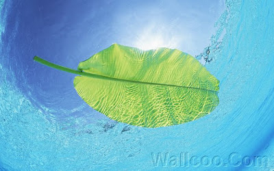
as geometric shapes that were created and approached as separate colors and textures. The painting as I mentioned in the last post is a painting of a single leaf on water. There is not much as far as details to create, in the previous painting we could capture a region of the painting with detail and connect the areas of detail, in this painting the simplicity and subtlety of the image forces you to keep the transparency fresh and light and to capture the effect by the layers of each area we create.
The first task was to create a layer of soft blue sky which was not like the blue green of the water. Next was to put a dark line to denote where the bubbles of water were, this area created a definite division of value and contrast and allowed the viewer to see the sky above as a distance. The lack of detail forces you to exaggerate comparison of detail so the viewers’ eyes have enough cue to know how far they are seeing into the painting.
Once we created the area of turbulence we blurred it into an area where the water turned more green and definite blue green lines created the movement, this again separated the turbulent area near the leaf from the depth of the water beneath it. This was the third zone and the layer to the left of the leaf was another area of bubbling water which interacted with the leaf.
The two areas that we are leaving alone are the leaf and the light above it- this last area of the painting will contrast strongly to the water around it and the light will glow because of the difference between it and what surrounds it. Again we are not painting the actual image, we are painting what reflects around the image and how the light reacts and the colors and contrast are affected by the comparison to the light and the leaf. After we are done with what the leaf is reflecting on and with we will further perfect the leaf and the light and either ratchet up the contrast or tone it down.
In the end complementary highlights will be weaved throughout the final image to lead the eye through the image and create the flow that make the leaf look like it’s floating. The idea of this post is how detail can be seen where there is no detail and created out of the lack of detail. The changes must be in hue, texture and contrast which creates the depth and interest a painting like this might lack because of it’s lack of detail. Next post will be about the subtlety of transparency and allowing the canvas to show through.
Another technique we did this time was smoothing of the paint with a paper towel instead of a brush, it softens up the image and allows the viewer not to be able to discern the difference as colors change. Another plus is the fact that the transparency is achieved by putting paint down and lifting most of it up-the canvas shows through and mimics the feeling of soft intangible light, something easily lost with using white which makes a more pasty feel.
 |
| This photograph is from Wallcoo.net and is a free wallpaper |
