Tag Archives: art

Illustrations using Adobe Illustrator

Illustrations: Passionvine and Bumble Bee

Purple Passion vine illustration using Adobe Illustrator

I have been illustrating in Adobe Illustrator for many years and after a many parts and end equipment I thought it was time to expand my subject matter. How I actually started working in the high-tech industry doing technical drawings and the occasional illustration was by showing an image of a green tree frog to a potential employer. It was the first attempt at illustrating using a PC-the program was Arts and Letters Jurassic Arts and the tools were basic at best.

Illustration with Multiple Software Applications

I have since worked in Micrografix Designer, Corel Draw even freehand and finally the standard adobe products-Illustrator and Photoshop. After writing about the life of a goldfish I decided to illustrate the image instead of using a photograph and what follows is how I approach illustrating in Illustrator.

Shape

My first and most basic process is just getting the shape and basic colors and tones down. This is the fastest part of the illustration. I will usually follow the lines of color and shadow and create layers of light that cover up layers of shadow.

Image 1-basic form

Color and Detail

After I feel the overall form is correct I will layer the colors again almost like the rings of a tree-you overlap each color with the form that overlaps it. You will notice every change and try to process it as if there were multiple layers of shapes that make the final form. I try to use as little gradients as they can tend to be contrived-if I do use them they need to be very subtle.

The second figure shows a minimal change from the first. Basic overlaying of colors that allow the background to show through and adds depth to the illustration. Detail is not as important at this point as there will be overlying of details and softening of edges after this stage.

Image 2-overlays of colors-layering for effect

The third step is where all the details begin taking shape. Again hard edges are overlapped

with lighter softer edges. At this stage I need to realize the overall texture and the best

way to create a subtle dimensional feel to the image.

Image 3-overlaying two

Details

By the third step the most intricate color and details become the major focus. I start cleaning up the basic shape and making sure all the proportions are right. The lines and detail is severe at this point because with the next step I will use the brush to merge the shapes to form a subtle more photographic image.

Brush Strokes

The final step is actually using brush strokes to overlap the hard edges of the previous step. Light and shadow overlay the original details and blocks of colors with varying degrees of opacity allows for more subtle effects.
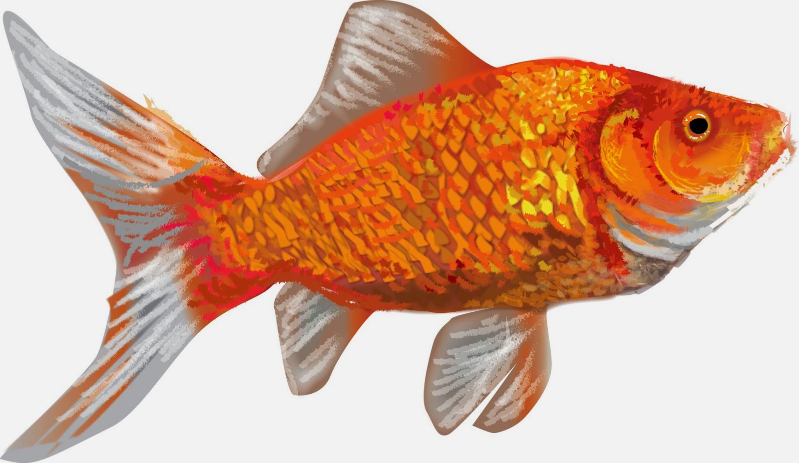
Final step before creating background

After finalizing the details and colors of the fish I create a background. I don’t want much detail in the background so brush work and simple heavily feathered images create a backdrop that strives to not fight with the image of the goldfish.

Finished product using Adobe Illustrator

This was a previous post from blogger and I though with the new illustrations for R.L. Claytons’ first children’s book Penelope the Pooting Spider-I thought it was appropriate to share the article on techniques for illustrating with Adobe Illustrator.
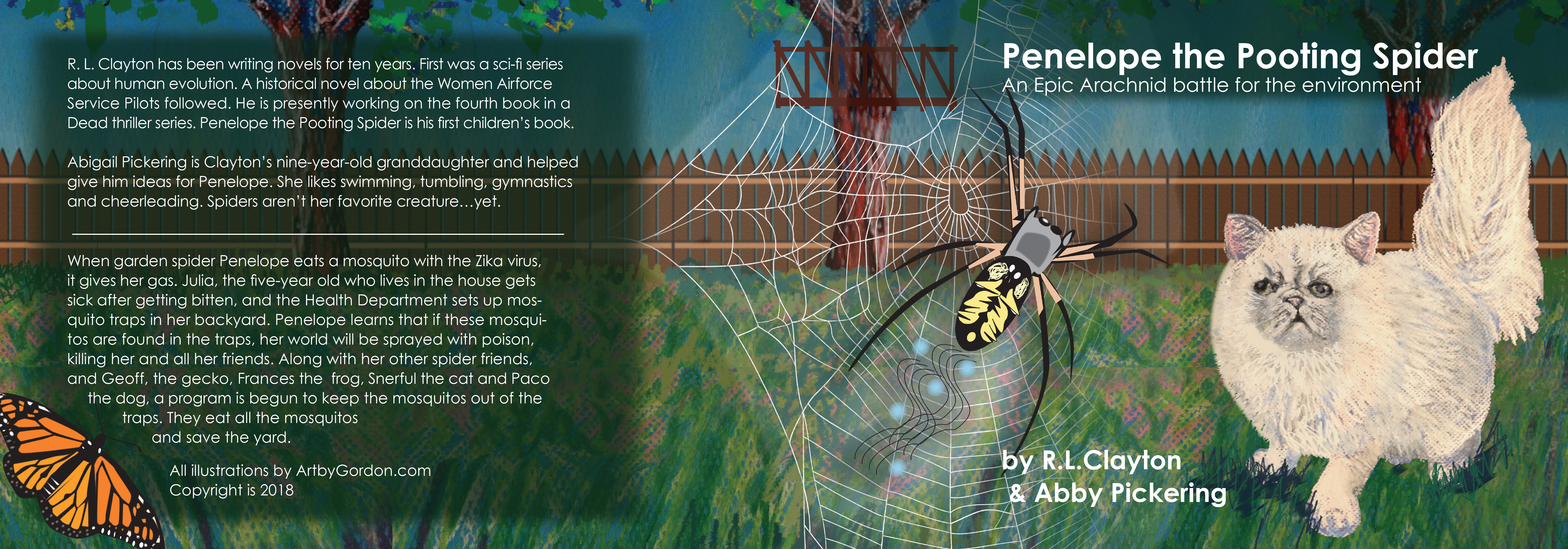
We started with the cover and the interior was a watermarked version of the cover with characters highlighted on each page.
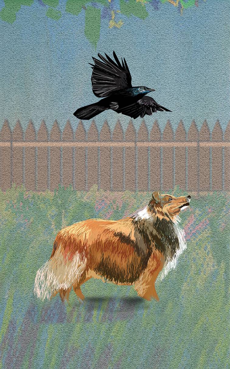
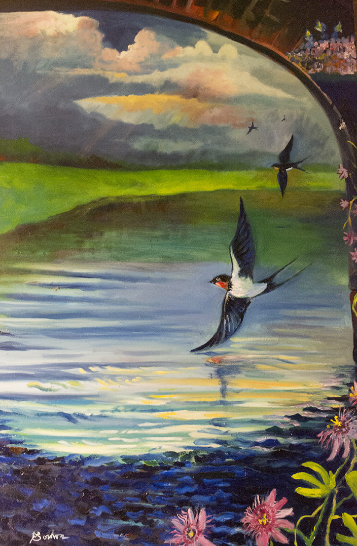
 

I added illustrated versions of the animals from illustrator but the cat and the field was created by hand with pastels. I then photographed and adjusted for color and texture.
For more illustrations using Adobe Illustrator-

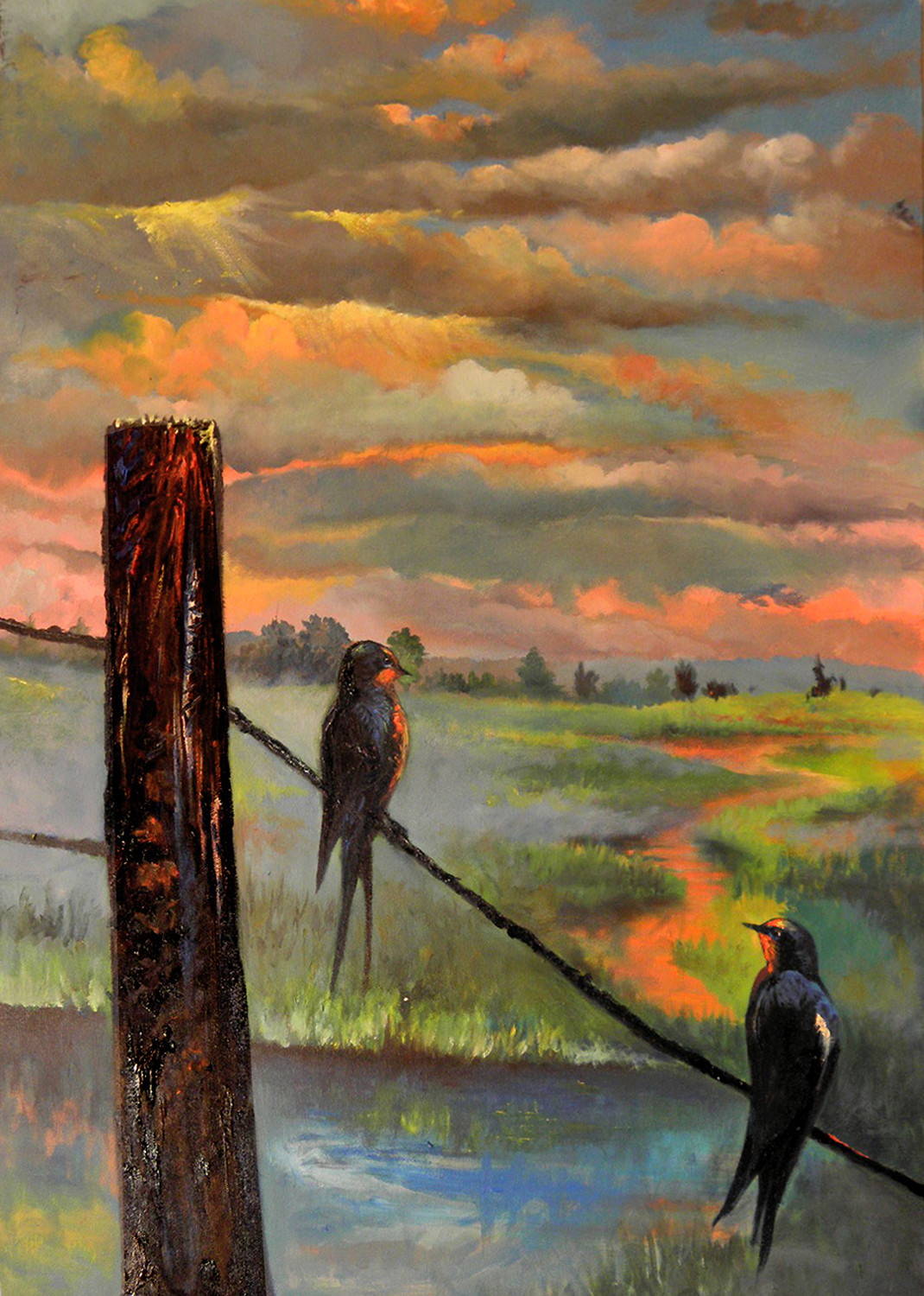
Celebration: Third in a Series of Paintings of Swallows

Celebration: Series of Swallows – Birds are not only a passion of mine they represent nature and often are the most accessible species in the suburban backyard. I remember going to my grandmothers’ in Orange New Jersey-out of the a concrete landscape of the city there were birds, not many but enough to offer some nature amidst concrete.

Over the years of writing and painting, certain birds have become symbolic in my work. The two most prominent are blackbirds and owls but recently the swallow has sparked my interest.

There is a song by Sparklehorse called the pain birds and on the album Good Morning Spider is a swallow. The first in the series is actually called the painbirds and it was during a time of great upheaval in my life.

The painting sat on the wall unfinished for more than a year, just the bridge and the water. I knew it was going to be swallows but I just couldn’t decide how and where the birds would appear. Next came the purple passion vine, a very religiously significant plant that I collect, all of these elements finally gelled and the Painbirds was born.

The second in the series came about with a lot less symbolism. I focused more on the relationship of two birds on a wire and the landscape that expanded behind them. Again, it sat unfinished for a long time as the image came together.

The problem is that the initial idea is filled with excitement and direction but after some time the overall details fade. This is why I can’t paint when I feel like painting, it seems you either see the details and textures and the way they need to be rendered or you don’t.

Birds on a Wire was the second in the series and it was just as large as the first one. Notice the change in colors, the richness and warmth replaces the cools and somewhat melancholy of the pain birds, it was a bit more comfortable time in my life and I believe I was much happier. The sunset does have a bit of symbolism of change and the possibilities of tomorrow and becoming comfortable with things ending.

The last in the series is the Celebration. I watched as the recent drought ended and Lake Ray Hubbard was full again, the swallows swarmed the bridge as if they were celebrating the end of the drought. It is the smallest painting of the three with the most birds.

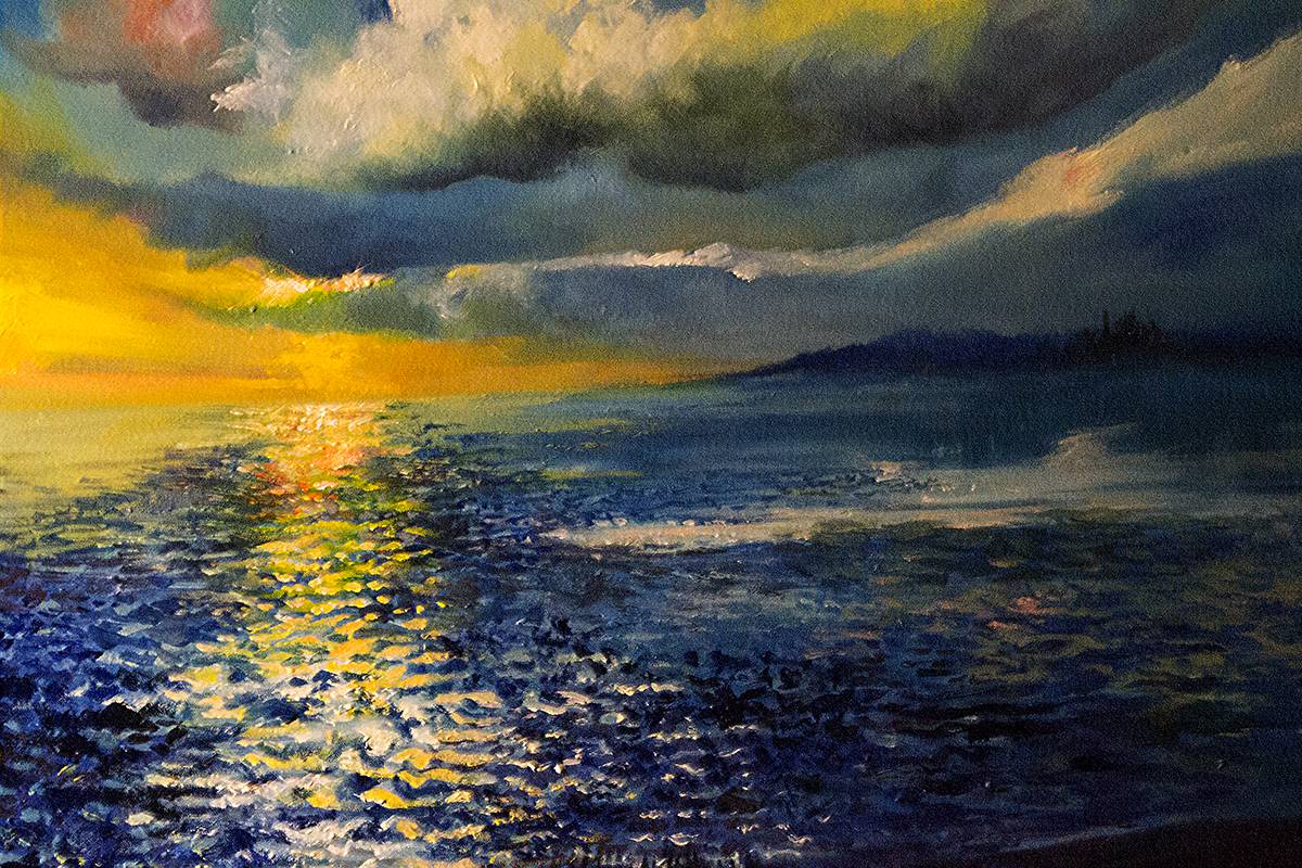
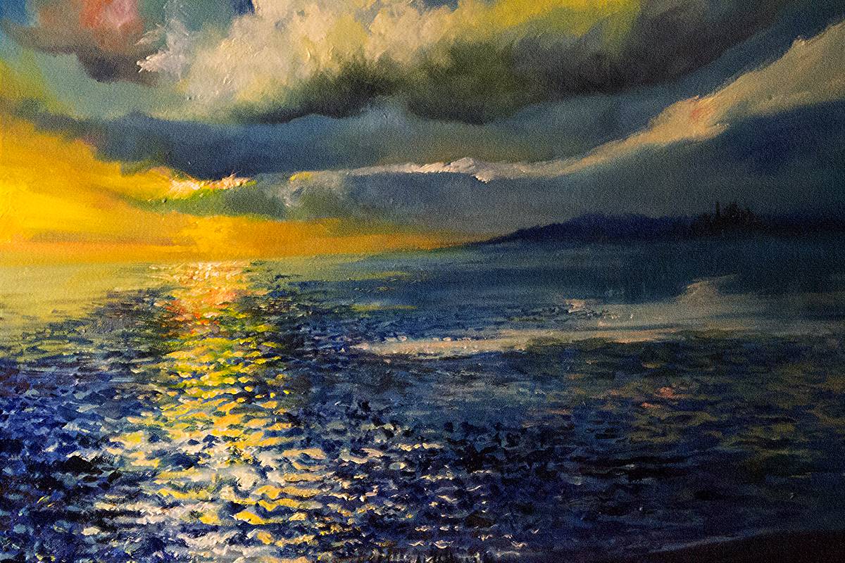
It also marks a time where I am getting back to water at its simplest aspect. I wanted to get back to the way I used to paint water. I have recently departed from the clarity and depth and explored bright colors and reflections. I am going back to the basics and why I started painting water in the first place.

I have several paintings in the works, one is of grackles, another of egrets, I am getting back to studying nature with more depth and understanding. I am also working on some abstract images that are a bit less about nature and more about the human condition.

Stay tuned and please let me know which of the series you prefer and why.

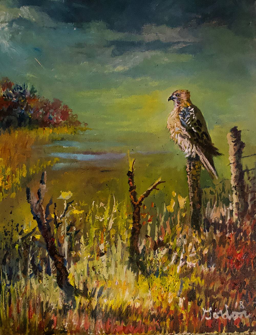
The Watchman: Red Tailed Hawk

The Watchman: Red Tailed Hawk – This image was inspired from the East Texas Roads, I was selling insurance. I got to enjoy a lot of mileage and gathered a lot of inspiration for paintings.

I finally got a chance to paint. It was a stormy afternoon as you can see from the remnants of a swollen stream in the distance.

I got more information and sketched more on a trip to Hagerman where there are always hawks patrolling each fence row. There are a  lot of red tailed hawks and I consider them the watchmen of the meadows and fields.

Oil on Canvas 2018 ArtbyGordon

Finishing Paintings: A New Series Finds Closure

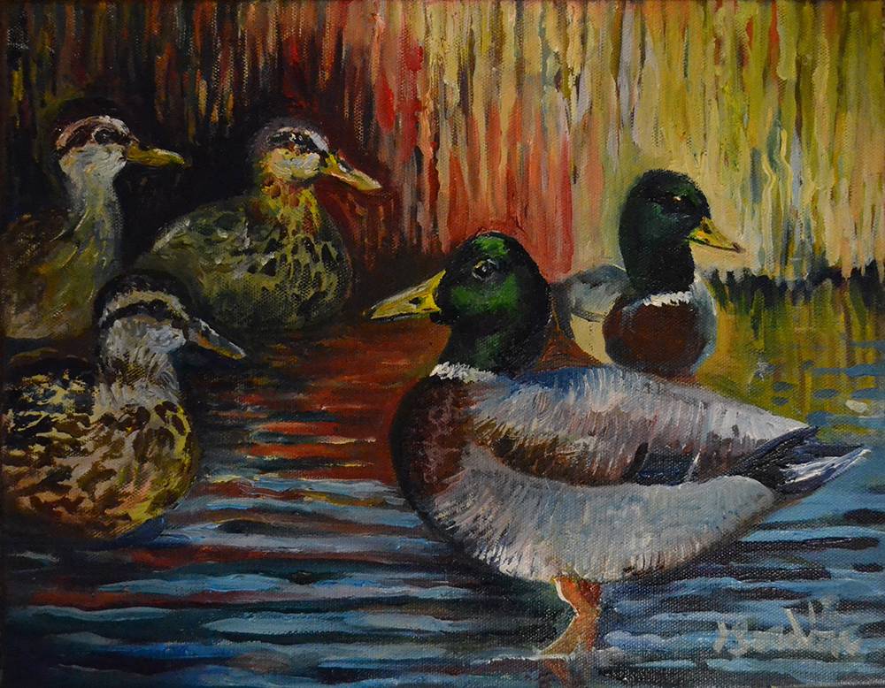
New Painting Series – This painting was inspired by a ride in East Texas. I liked the grouping
of the drakes and the females looking on. It was a quick snapshot that turned into a long process of capturing a cool autumn day.

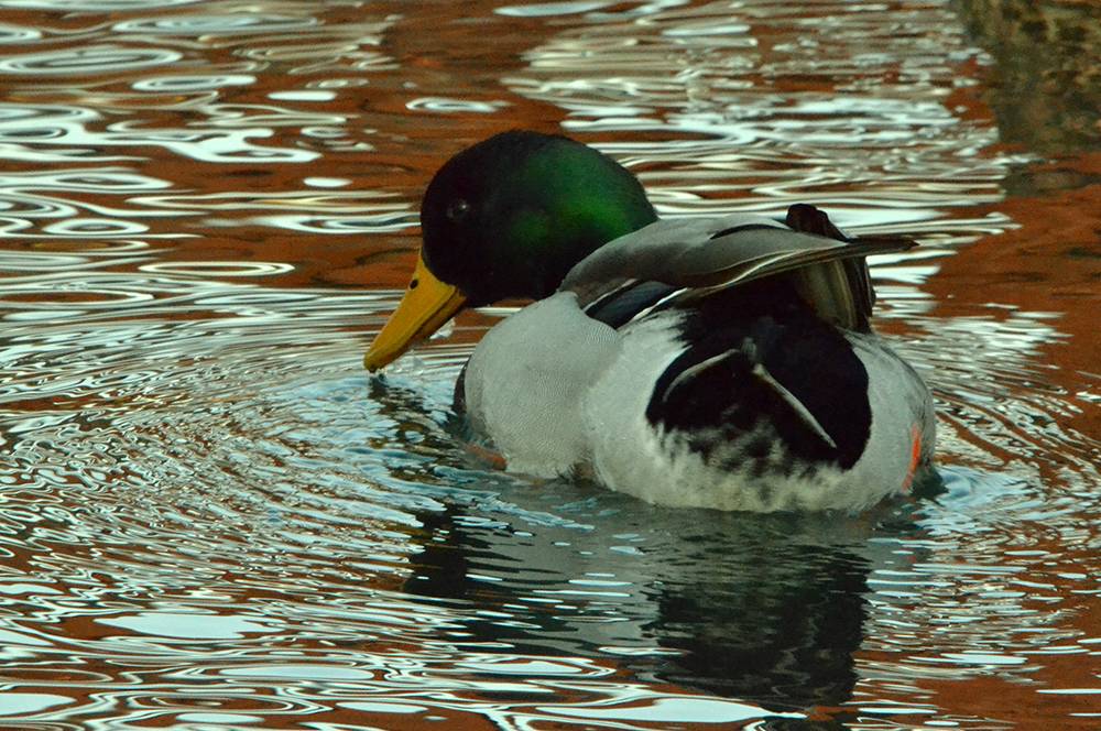
Since I started the painting, there have been many starts and stops. I have also had several times studying mallards at a local park to get the personality and eyes right on the males.

I aim to capture that relationship between characters in nature. When I go and study the ducks, they always know I’m there, they just keep their comfortable distance.

I was also aiming for the dark colors of autumn but the warmth of light on the reeds and the shiny green heads of the males. This is the first in the series, tomorrow I will have another I just finished: A hawk from a fence near Hagerman Wildlife Refuge.
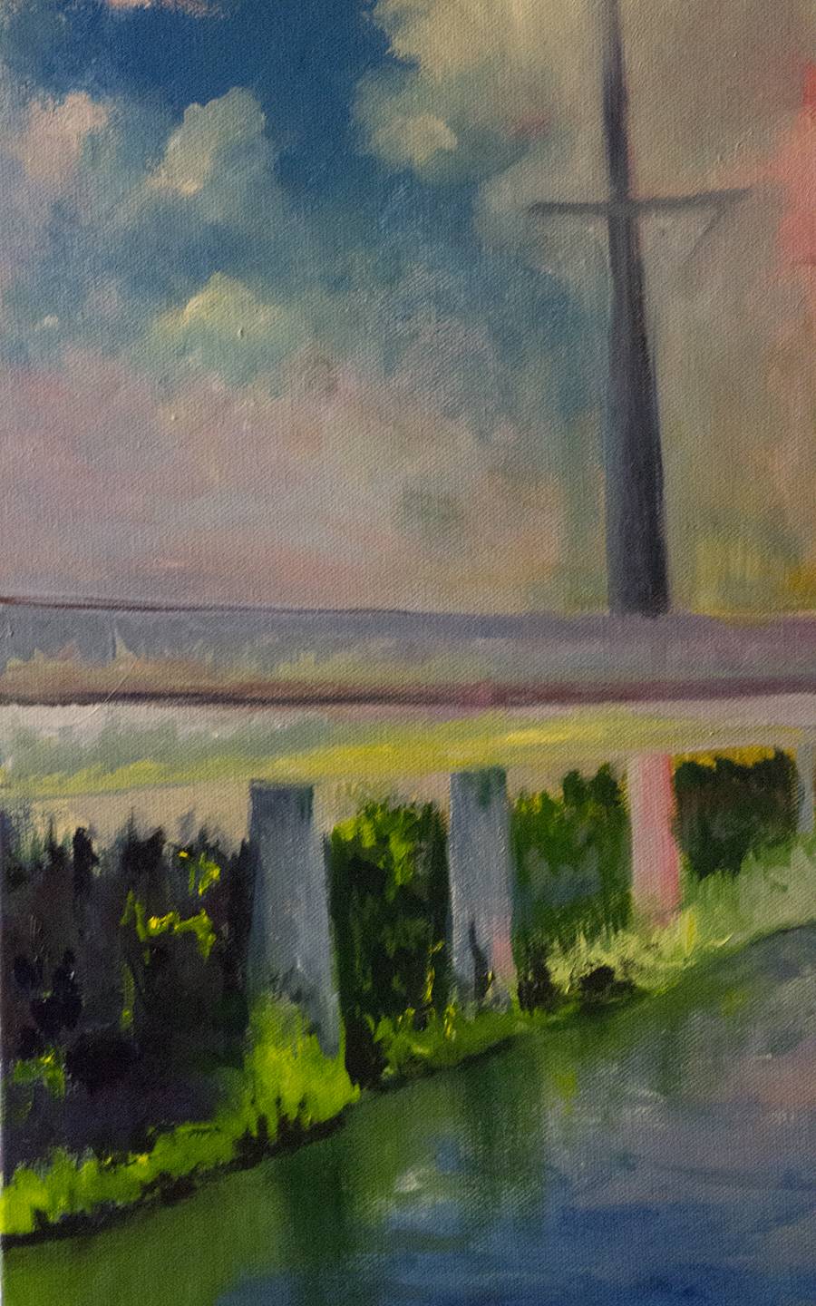
Drakes

Naturally Graphic available at Fine Art America

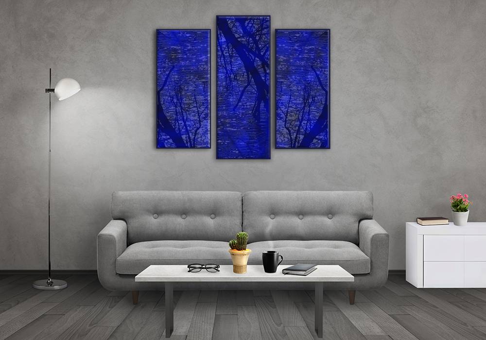
Naturally Graphic – Images are available on Fine Art America. Working on adding to a large inventory of abstract nature images that will be available soon.

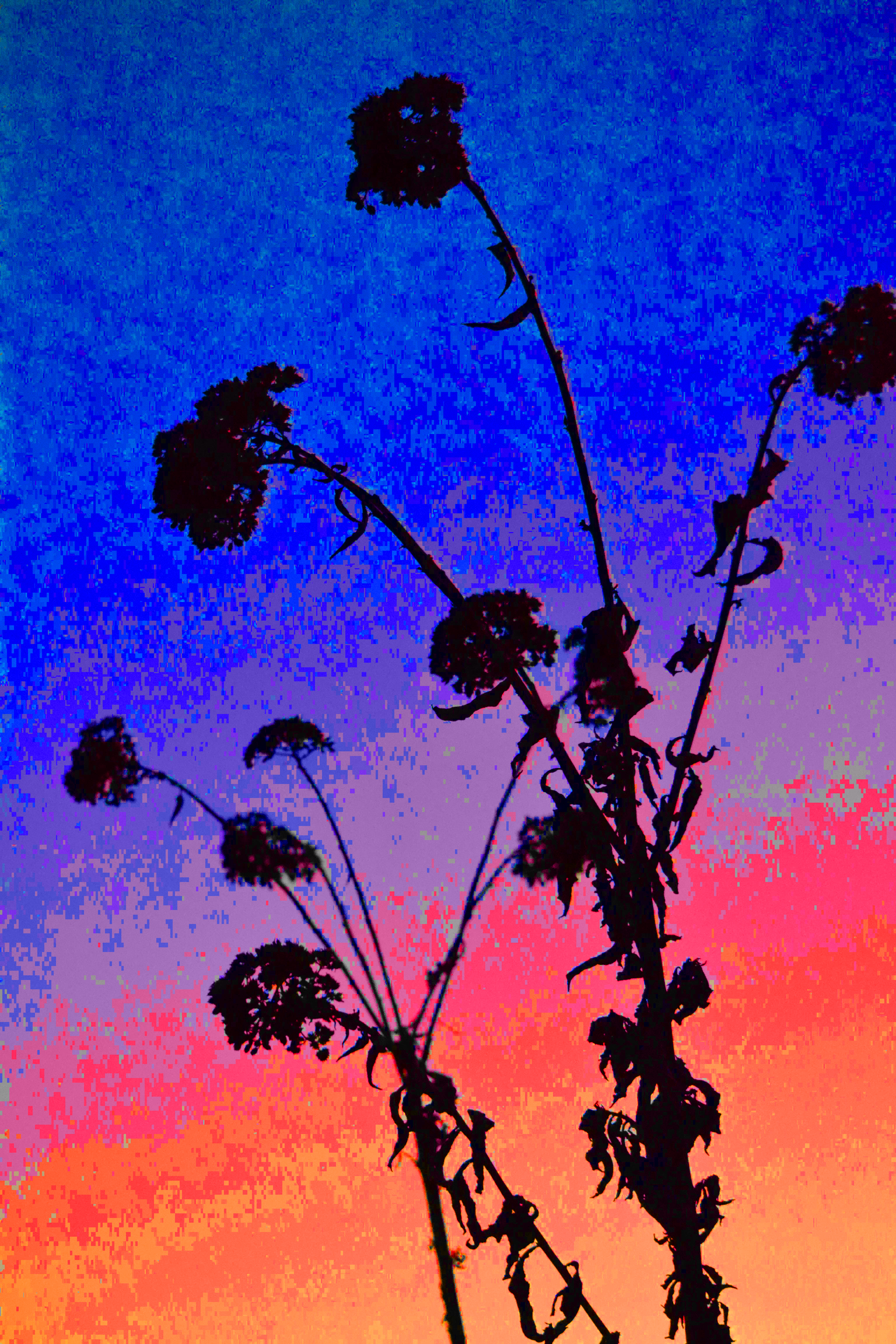
Milkweed plant abstract print available on Fine Art America
Red Photinia Abstract print available on Fine Art America


Autumn Pond abstract available on Fine Art America

Sunset: Discipline in creativity

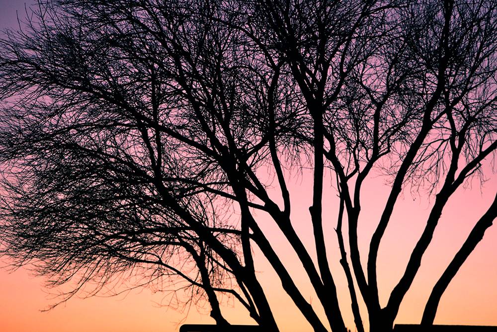
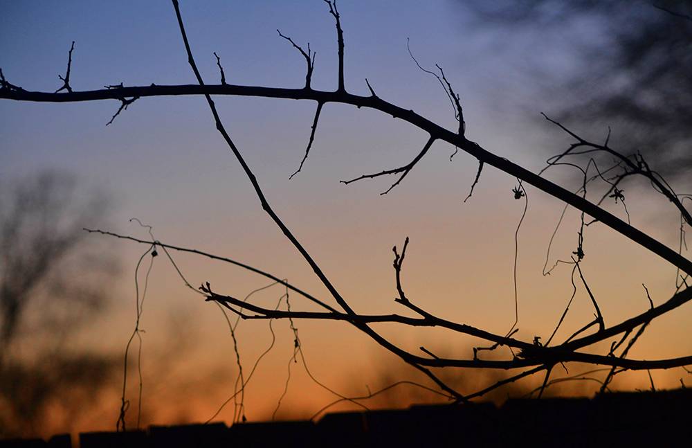
I am working hard to continue to find objects that can be used in abstract images for wall decor. Tonight I found the silhouettes of summers’ garden made dramatic imagery.

To create when nothing inspires is where discipline comes in. You are forced to see beyond a gray winter day and seek light when there is none available and I believe that is the fuel that feeds creativity when the muse doesn’t show.

I have also been in a situation where the scenery was so breathtaking you couldn’t do it justice even if you tried. I was in Glacier National Park and between altitude sickness and a feeling of being overwhelmed, it was hard to shoot something that was truly remarkable.
There is a great space where you need to work a bit harder to see beyond what is obvious and yet the light is perfect, this is the sweet spot and what follows is a landscape where the creative thrives.


Fear of the Canvas

florida_intercoastal

Fear of the Canvas – I’ve just realized why I have been avoiding painting recently, not really avoiding it but just having a harder time settling down. Many of the works have been in progress for quite a while so getting back to them is often like picking up a strangers painting.

The amazing point is when suddenly you stop thinking about what you need to do and just start slashing at the canvas with purpose. There are unseen shapes and connections of shapes that come out of the surface of the paint and you fill in the blanks instinctively.

A stumbling block is the fear, especially when you like what you’ve started but there is no room for timid strokes in painting or anything else creative. Once you stop and think or attempt the safe way you might as well save painting for later.

Painting should be bold, excited and even a bit reckless. My thought is every painting is a potential mistake that will never see the light of day. This is the time you learn the most, when you are free to forcefully and confidently paint without fear of failure.

One particular technique that takes a lot of time going back and forth is the light on water, it starts out overly dramatic and slowly becomes more realistic. There are points where the light seems right, others when there seems to be a bump in the horizon and you have confidently fix the problems and continue to focus while you see the image you’ve been working on go from good to worse to good again.

Another aspect is painting objects, straight lines and architecture, something that often needs to be reworked and perfected. You are happy with the background and suddenly you’ve just destroyed it with the object that you overlapped-often the background needs to be reworked with the object as you work to perfect both.

I am excited about the process and while I continue to get bits of time to paint, I am adding to an already large painting list. Let me know what you think of the new images.
swallowspsd

Painting: Deliberate until something develops

undertheseasm

Painting Deliberately – There are so many different feelings when you paint, sometimes it’s pushing paint around, sometimes it’s deliberate, even mechanical and sometimes it’s instinctual, tonight’s  sitting was a little bit of all of them.

I started with an under painting and it was one of the more deliberate paintings I’ve started, unfortunately I didn’t have the full picture, just an idea of clouds moving forward over the viewers head. The actual image is from real life, I have photographs for reference but I’m not completely sure where the clouds end and what the landscape looks like.

I painted the background with perspective lines, every form, every color and every space will be designed with the idea of perspective and I want the viewer to feel overwhelmed by the clouds overhead.

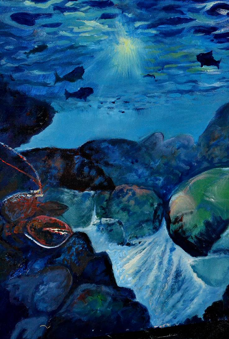
As I tend to do, I switched gears after finishing a monochromatic under painting I turned to the painting of a scene from beneath Shark River Inlet in Belmar New Jersey. This painting was inspired thirty plus years ago and it still stood clear.

I painted with a clear feeling of purpose but as suddenly as it began it ends and I wasn’t sure if I was done with the painting or should start all over. The problem is the idea and image is strong but the recollection is so hard to bring back to mind. I will continue to study it until I know it’s either done or time to start over.

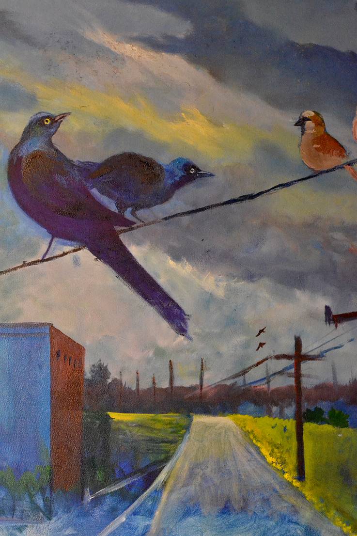
Another thing about painting, sometimes you feel like you’ve created your best work and sometimes the same painting looks like a mistake. I got back to the grackles above the city, an image that I started at the end of the last series, again I had that feeling of instinct kick in and for thirty minutes or so I painted like I figured out the problem.

None of the paintings are finished but I feel like I’m shaking off the stagnation and getting in the process. The most exciting thing about painting instinctual is that images appear that you didn’t necessarily know you were creating they just come out of the details you’ve worked in feverishly.

I’m excited about this series and feel it will be a huge step toward my future painting style and feel.

Stay tuned, more paintings coming very soon.

gracklessm