Illustrations: Passionvine and Bumble Bee
 Purple Passion vine illustration using Adobe Illustrator |
I have been illustrating in Adobe Illustrator for many years and after a many parts and end equipment I thought it was time to expand my subject matter. How I actually started working in the high-tech industry doing technical drawings and the occasional illustration was by showing an image of a green tree frog to a potential employer. It was the first attempt at illustrating using a PC-the program was Arts and Letters Jurassic Arts and the tools were basic at best.
Illustration with Multiple Software Applications
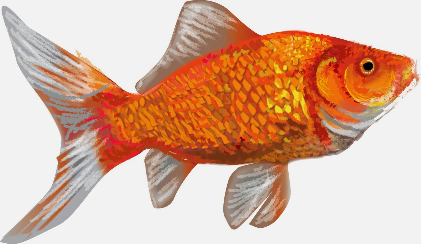
I have since worked in Micrografix Designer, Corel Draw even freehand and finally the standard adobe products-Illustrator and Photoshop. After writing about the life of a goldfish I decided to illustrate the image instead of using a photograph and what follows is how I approach illustrating in Illustrator.
Shape
My first and most basic process is just getting the shape and basic colors and tones down. This is the fastest part of the illustration. I will usually follow the lines of color and shadow and create layers of light that cover up layers of shadow.
 |
| Image 1-basic form |
Color and Detail
After I feel the overall form is correct I will layer the colors again almost like the rings of a tree-you overlap each color with the form that overlaps it. You will notice every change and try to process it as if there were multiple layers of shapes that make the final form. I try to use as little gradients as they can tend to be contrived-if I do use them they need to be very subtle.
The second figure shows a minimal change from the first. Basic overlaying of colors that allow the background to show through and adds depth to the illustration. Detail is not as important at this point as there will be overlying of details and softening of edges after this stage.
 |
| Image 2-overlays of colors-layering for effect |
The third step is where all the details begin taking shape. Again hard edges are overlapped
with lighter softer edges. At this stage I need to realize the overall texture and the best
way to create a subtle dimensional feel to the image.
 |
| Image 3-overlaying two |
Details
By the third step the most intricate color and details become the major focus. I start cleaning up the basic shape and making sure all the proportions are right. The lines and detail is severe at this point because with the next step I will use the brush to merge the shapes to form a subtle more photographic image.
Brush Strokes
The final step is actually using brush strokes to overlap the hard edges of the previous step. Light and shadow overlay the original details and blocks of colors with varying degrees of opacity allows for more subtle effects.
 |
| Final step before creating background |
After finalizing the details and colors of the fish I create a background. I don’t want much detail in the background so brush work and simple heavily feathered images create a backdrop that strives to not fight with the image of the goldfish.
 |
| Finished product using Adobe Illustrator |
This was a previous post from blogger and I though with the new illustrations for R.L. Claytons’ first children’s book Penelope the Pooting Spider-I thought it was appropriate to share the article on techniques for illustrating with Adobe Illustrator.
We started with the cover and the interior was a watermarked version of the cover with characters highlighted on each page.