Category Archives: graphics

A Body of Work

It’s been more than ten years when I first met R.L. Clayton, he is a science fiction writer and I met him through a friend. He wanted a cover image of a futuristic ship that didn’t exist. Challenge accepted!

Sea Species was born. We both invested time and patience to envision an image that didn’t yet exist. That is the job of a designer when you are creating something that is not your own, you need to listen and get out of our own ideas and allow the client’s vision to become real.

Little did I know at the time, but I was about to create a library of books that all stemmed from one project.

A lasting business relationship quickly turned into a friendship even though I have never met him in person.

In these days that the bottom line trumps loyalty and integrity, it is a very rewarding experience working with a client on a basis of trust and the old fashioned idea of a handshake.

Next came the Envoy and soon after that the Genesis. I created his website for the evolution river series and posters for book readings. We also started a social media presence and a monthly email.

The next book was about the woman pilots of World War II. It was a departure from science fiction to a story with a historical backdrop. Another book and another cover was created and as the list of books grew so did the website.

R.L. Clayton books website began with R.L. Clayton descending in dystopia back before dystopia was a thing. I listened to the creepy ideas that spawned the next cover in the collection.

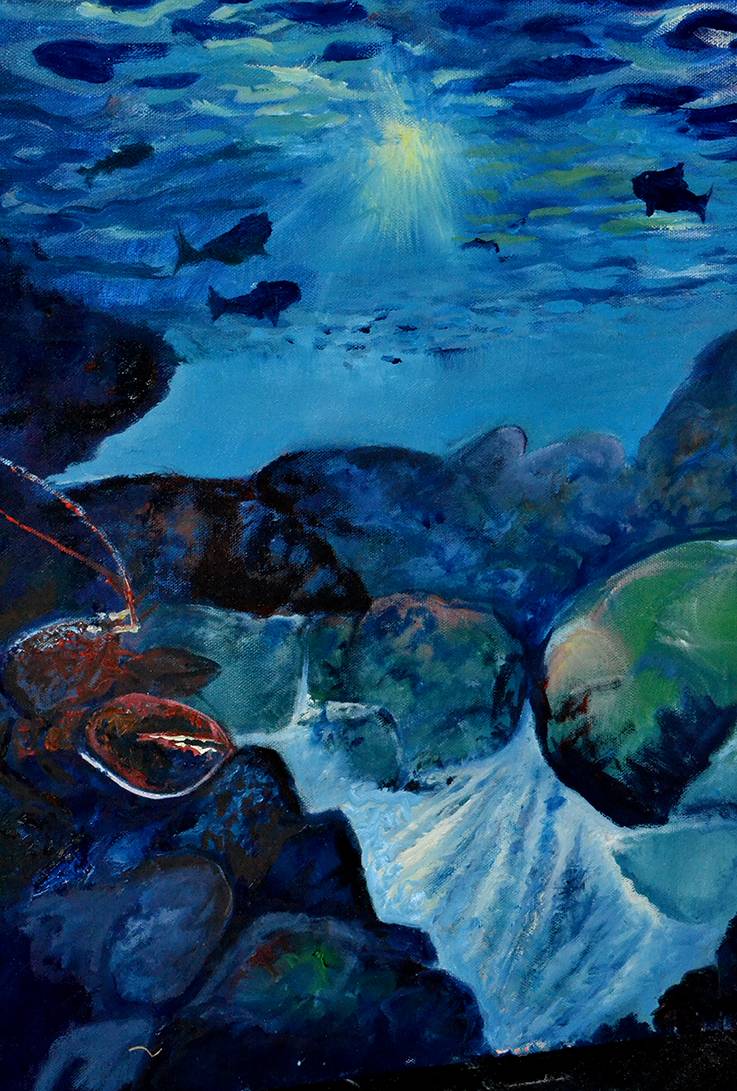
The Dead series began with a book about terrorists, on the cover was to be a coffin with a life meter on the face; Dead and Dead for Real was born.

The writer’s vivid ideas began creating a definite brand and a look and feel that grew as we continued to produce new books.

In this time I learned the art of creating an e-book and suddenly besides the printing issues we learned and tackled the problems associated with creating an e-book.

Grunge style background with blood splats and drips

R.L. Clayton books grew as more books were added to the library. The next frightening book in the series was Dead Reckoning, a child with a bubble wand blowing dangerous chemical agents into the air. The whole idea and darkness of the Dead Series truly inspired my love of the macabre.

Dead again followed Dead Reckoning and the next chapter in the series leads back to the Envoy in the Evolution River Series. It is very exciting to see a writer create a body of work and I feel like I am on a journey that continues to inspire me and reach for more creativity.

As I continue to grow my skills and knowledge of book marketing we are seeing how the public reacts as each book is produced and Clayton attends book readings. We have recently gotten some great reviews on the Dead series and am anxious for the next book to be finished.

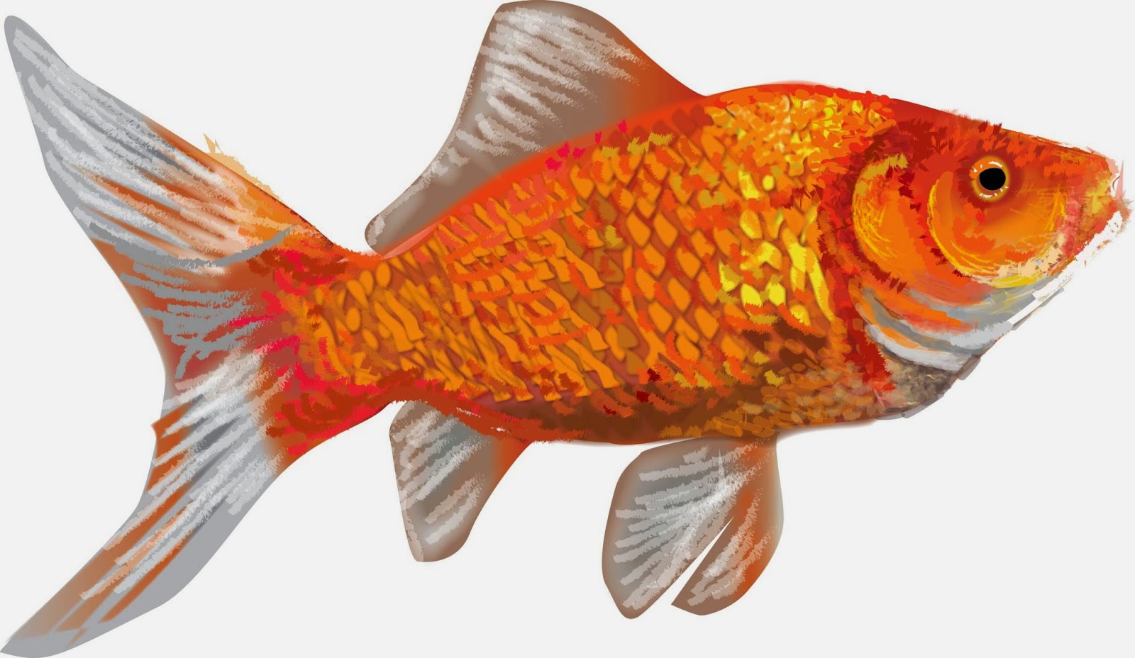
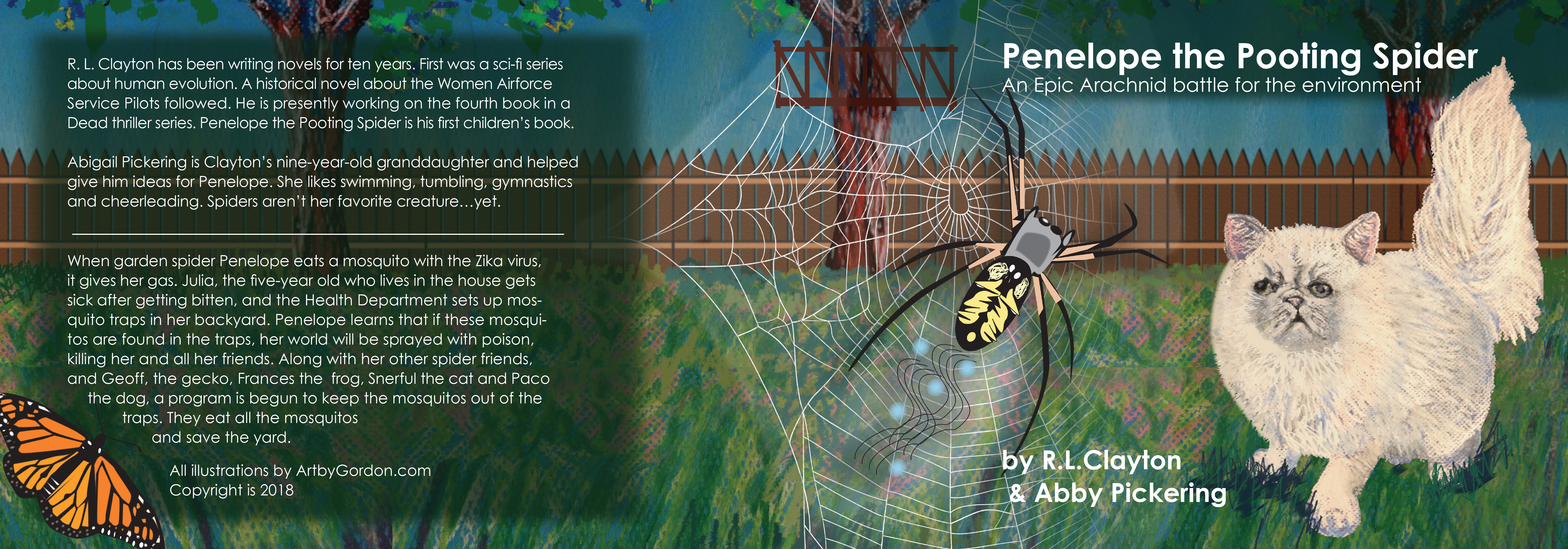
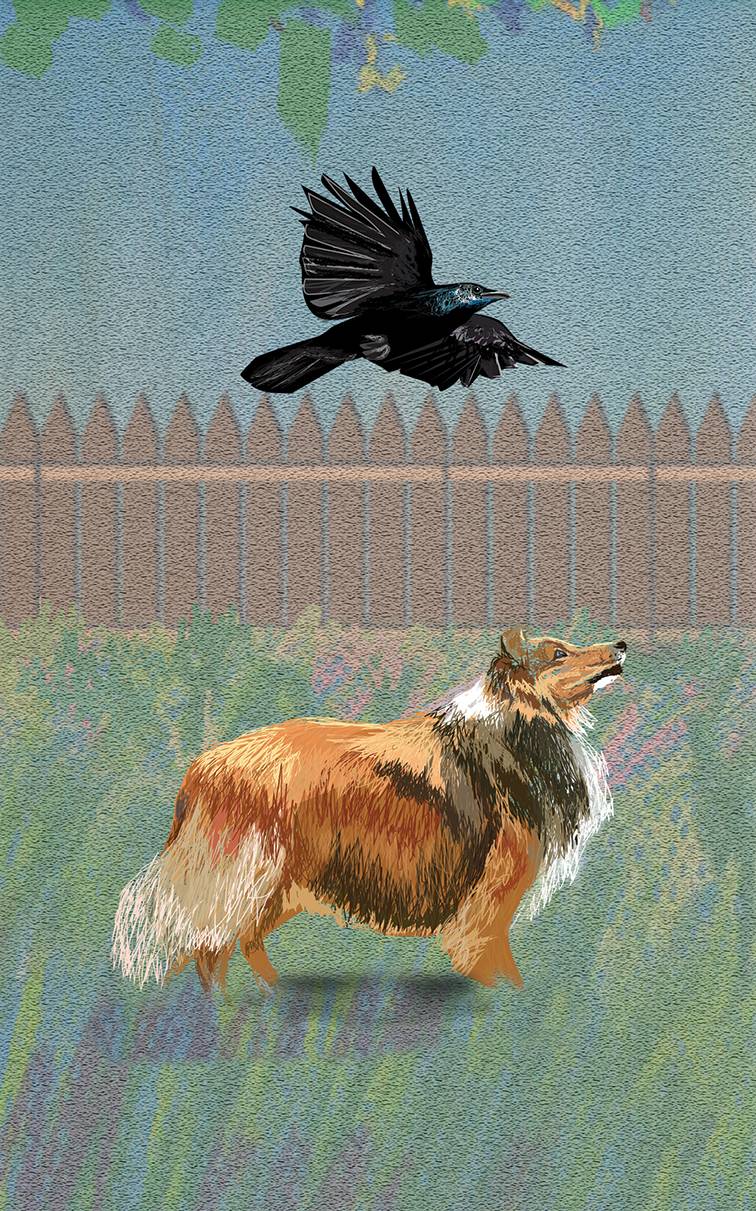
During the process of creating all the books, Clayton had mentioned a book he was thinking of with his 9-year-old granddaughter, a children’s book. The first cover we tried was with real photographs and than we decided pastel was the way to go. Inside of the book are 12 separate illustrations of the yard in pastel and the characters besides the cat were all created in Adobe Illustrator.

The book is finally available on ebook and in print on Amazon. During this process we have learned about publishers, I’ve created a video for the evolution river series, two websites, several reviews and two websites. We both have learned from a relationship that has lasted more than ten years and I am excited about the new projects and the new books we’ll come to create, in fact other children’s books are on the list as well. We’ll see.

All of this knowledge and experience came from a trusting and mutually rewarding relationship and I consider myself lucky to be able to work with a great write like Clayton.

Please check out his books at www.rlclaytonbooks.com.


Illustrations using Adobe Illustrator


Purple Passion vine illustration using Adobe Illustrator

I have been illustrating in Adobe Illustrator for many years and after a many parts and end equipment I thought it was time to expand my subject matter. How I actually started working in the high-tech industry doing technical drawings and the occasional illustration was by showing an image of a green tree frog to a potential employer. It was the first attempt at illustrating using a PC-the program was Arts and Letters Jurassic Arts and the tools were basic at best.

I have since worked in Micrografix Designer, Corel Draw even freehand and finally the standard adobe products-Illustrator and Photoshop. After writing about the life of a goldfish I decided to illustrate the image instead of using a photograph and what follows is how I approach illustrating in Illustrator.

My first and most basic process is just getting the shape and basic colors and tones down. This is the fastest part of the illustration. I will usually follow the lines of color and shadow and create layers of light that cover up layers of shadow.

Image 1-basic form

After I feel the overall form is correct I will layer the colors again almost like the rings of a tree-you overlap each color with the form that overlaps it. You will notice every change and try to process it as if there were multiple layers of shapes that make the final form. I try to use as little gradients as they can tend to be contrived-if I do use them they need to be very subtle.

The second figure shows a minimal change from the first. Basic overlaying of colors that allow the background to show through and adds depth to the illustration. Detail is not as important at this point as there will be overlying of details and softening of edges after this stage.

Image 2-overlays of colors-layering for effect

The third step is where all the details begin taking shape. Again hard edges are overlapped

with lighter softer edges. At this stage I need to realize the overall texture and the best

way to create a subtle dimensional feel to the image.

Image 3-overlaying two

By the third step the most intricate color and details become the major focus. I start cleaning up the basic shape and making sure all the proportions are right. The lines and detail is severe at this point because with the next step I will use the brush to merge the shapes to form a subtle more photographic image.

The final step is actually using brush strokes to overlap the hard edges of the previous step. Light and shadow overlay the original details and blocks of colors with varying degrees of opacity allows for more subtle effects.

Final step before creating background

After finalizing the details and colors of the fish I create a background. I don’t want much detail in the background so brush work and simple heavily feathered images create a backdrop that strives to not fight with the image of the goldfish.

Finished product using Adobe Illustrator

This was a previous post from blogger and I though with the new illustrations for R.L. Claytons’ first children’s book Penelope the Pooting Spider-I thought it was appropriate to share the article on techniques for illustrating with Adobe Illustrator.

We started with the cover and the interior was a watermarked version of the cover with characters highlighted on each page.


I added illustrated versions of the animals from illustrator but the cat and the field was created by hand with pastels and then photographed and adjusted for color and texture.
For more illustrations using Adobe Illustrator-

Naturally Graphic available at Fine Art America

Naturally Graphic – Images are available on Fine Art America. Working on adding to a large inventory of abstract nature images that will be available soon.

Milkweed plant abstract print available on Fine Art America

Red Photinia Abstract print available on Fine Art America


Autumn Pond abstract available on Fine Art America

Abstractions of Nature – Contemporary Art for Home and Office

Artbygordon abstractions of nature become art for home and office: Naturally Graphic

Abstractions of Nature – I love the patterns in nature. As an artist, finding a unique perspective that can show a viewer something they might not have seen before is a large part of my artistic intent.

I have always painted landscapes and seascapes but I could never perfect what is already real. I am competing with the greatest artist of them all: God. All I can hope for is to show the viewer an aspect of that image that moved me and perhaps move the viewer with the same or varied feeling.

As I have been photographing more regularly, I have found the need to see deeper than just the landscape. Especially when the light does not cooperate with the subject or doesn’t show up at all.

I learned to isolate parts of nature when my desire to photograph didn’t lend itself to the light of the day. On a gray winter day, when there is nothing but flat, bland light and no objects are discernible by any effective modeling,  I have discovered a new way of seeing the landscape.

I started seeing how images were painted by stray bits of light. Suddenly instead of a bland landscape, I was able to find just a piece of that landscape that could be a graphic object. I don’t even care if the final image is discernible, it is more the aspect of its abstract nature that intrigues me.

modern interior room with a beautiful furniture

I have started gathering autumn leaves, green leaves and patterns in water, in the past I would  have struggled to find something in abstract but now the image jumps out at me. It’s a muscle and to strengthen this way of seeing the landscape has changed my whole outlook on contemporary art.

I believe that bringing nature into the house can evoke a calm center as well as a conversation piece for visitors. I like how without representing a specific subject, the image evokes something without trying too hard to be abstract or artsy. I have found my way to the abstract and contemporary subject.


Interiors are from Adobe Stock-Photographic art Artbygordon

Painting: Deliberate until something develops

undertheseasm

Painting Deliberately – There are so many different feelings when you paint, sometimes it’s pushing paint around, sometimes it’s deliberate, even mechanical and sometimes it’s instinctual, tonight’s  sitting was a little bit of all of them.

I started with an under painting and it was one of the more deliberate paintings I’ve started, unfortunately I didn’t have the full picture, just an idea of clouds moving forward over the viewers head. The actual image is from real life, I have photographs for reference but I’m not completely sure where the clouds end and what the landscape looks like.

I painted the background with perspective lines, every form, every color and every space will be designed with the idea of perspective and I want the viewer to feel overwhelmed by the clouds overhead.

As I tend to do, I switched gears after finishing a monochromatic under painting I turned to the painting of a scene from beneath Shark River Inlet in Belmar New Jersey. This painting was inspired thirty plus years ago and it still stood clear.

I painted with a clear feeling of purpose but as suddenly as it began it ends and I wasn’t sure if I was done with the painting or should start all over. The problem is the idea and image is strong but the recollection is so hard to bring back to mind. I will continue to study it until I know it’s either done or time to start over.

Another thing about painting, sometimes you feel like you’ve created your best work and sometimes the same painting looks like a mistake. I got back to the grackles above the city, an image that I started at the end of the last series, again I had that feeling of instinct kick in and for thirty minutes or so I painted like I figured out the problem.

None of the paintings are finished but I feel like I’m shaking off the stagnation and getting in the process. The most exciting thing about painting instinctual is that images appear that you didn’t necessarily know you were creating they just come out of the details you’ve worked in feverishly.

I’m excited about this series and feel it will be a huge step toward my future painting style and feel.

Stay tuned, more paintings coming very soon.

gracklessm

So much to learn, So little time: 5 of 5

newgarden

Learning to Social – Back to the original post, it takes time. There are shortcuts to find and retaining clients but there are no shortcuts to knowing them. You can’t fake relationship with a potential client, you must be there for them as they are for you.

I speak with the metaphor of a gardener and being one, it seems appropriate. Disperse seeds, don’t expect a quick pay out but realize why you are in the business in the first place, do you care about your customers?

If you don’t care about them, they will quickly not care about you and your product. I believe in laying the future, getting to know people, having more people realize you may something they need and living life with a passion that pays when others endeavors don’t

In the end, I have no doubt that I will reap the benefits of the broad garden of pictures, thoughts and ideas which will one day be book covers, stories in e-books and paintings on walls, it just takes time, did I mention it takes a lot of time.

You just need to use your time wisely. Do what you love and do it well and often and share it with as many people who care about what you are selling, the rewards will come much like the garden that grows from the seeds you planted in the spring, and it will be beautiful.


The Sublime Magazine article on Artbygordon

Screen Shot 2016-04-23 at 3.41.17 PMScreen Shot 2016-04-23 at 3.41.00 PM

See full issue!

 <div data-configid="22638267/35120881" style="width:525px; height:371px;" class="issuuembed"></div><script type="text/javascript" src="//e.issuu.com/embed.js" async="true"></script>